Porkélingo
User Experience Design Project

Porkélingo
Team: Alicia chhay || Simran tandon || Macy chong
timeline: 12 weeks, 2019
Role: User REsearch, paper prototyping, videographer, moderator for user testing, flow diagram and user evaluation
Tools: Framer, miro, design techniques/methodologies, premier pro, pop
Our design solution Porkélingo is an app that allows you to learn new slang and it is specifically design for international people who have recently moved to a new country, or they might have been there for a while but are finding it difficult to social integrate with their peers. Our solution provides a fun and effective way to learn new slang as it provides tutorials, quizzes and competitions where u can practice the slang you have learnt with friends or other people around the world.
Process Overview

Problem Area
Successful integration is hard to measure because it is multi-layered, touching every part of the migrant experience, from education to housing, political participation and civic engagement (Gallagher, 2018). We decided to focus on International people who find it difficult to form lasting and substantial relationships with their peers due to communication barriers for example, subtle nuances prevalent in popular culture could often be lost in translation. There could also be a fear of asking what things may mean. From our research we discovered that:
Immigrants experience shame and fear of exclusion in their struggle to become integrated in the community. They have a sense of loneliness, have to struggle for equality and experience being neglected
We aim to provide them with more comfortable social experiences so they can connect with each other, find common ground and reduce the fear of asking for clarification or expressing confusion about not understanding the conversation.
Research Methods
Methods are a critical step in understanding your user's behaviour which allows you to gather insights to help create the best user experience. The research methods that we used were
Interviews
Semi-structured interviews were conducted using a combination of fixed-script questions and open ended questions. A total of 36 people were interviewed ranging from 16 to the oldest being 55, with the intentions of seeing how their different experiences or opinions to gain deeper insights into understanding the scenario better.
These were some of my interview questions:
What is your name, nationality and age?
Is this your first time living in Australia and if it is how are you finding it?
How has your experience been from when you first got here to now?
Do you socialise more with local people or international people? Why do you think that is?
Who do you prefer to socialise with more?
What is the most difficult social situation you have experienced since moving here?
Do you think this experience has affected how you interact with people now?
Do you feel like you’ve integrated into Australian Society? If so why if not, why not.
And so, I would ask them these questions and then depending on what they would answer with I would ask them more questions based off their answers.
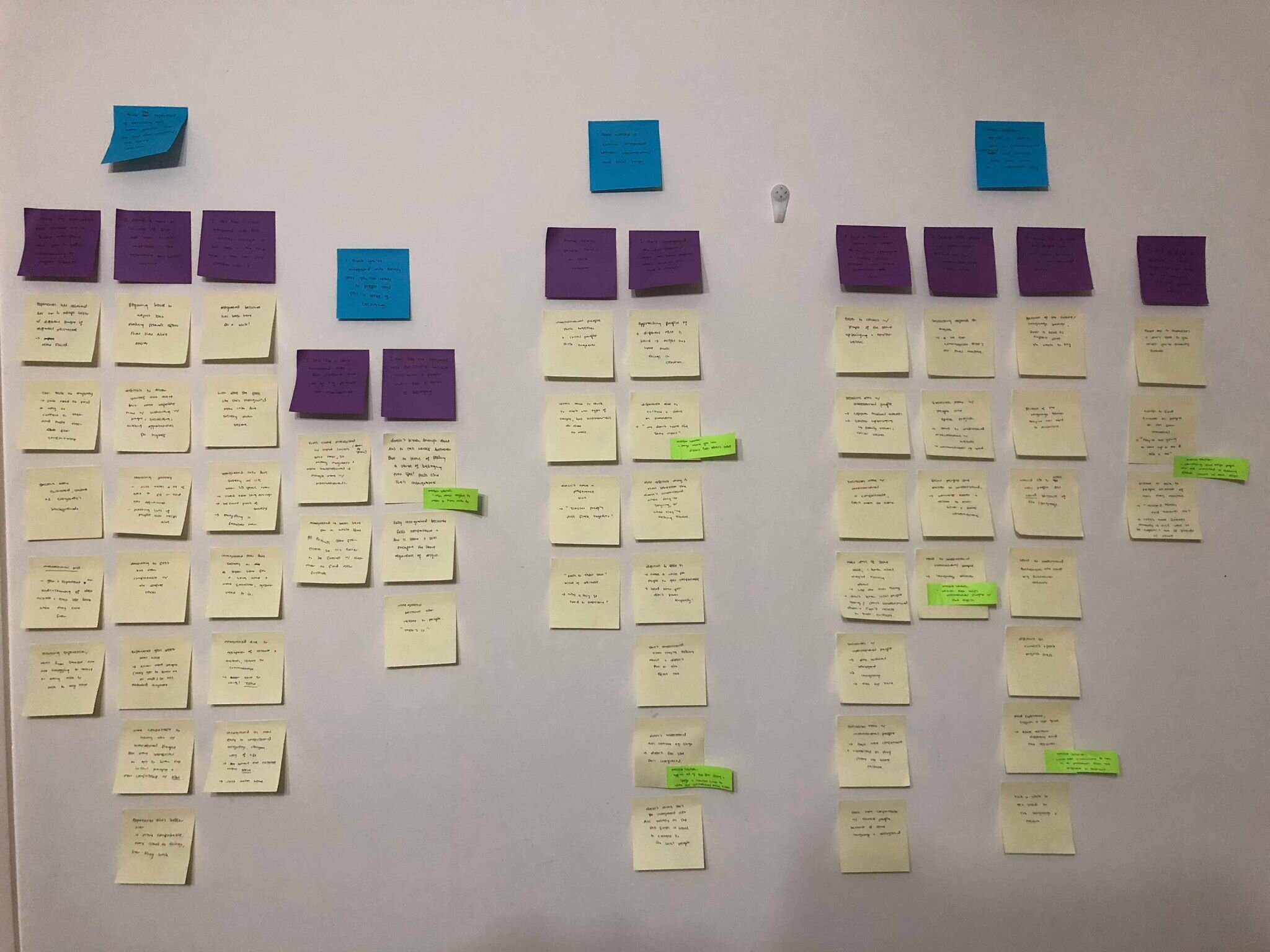
From my interviews I then synthesised the data using an affinity diagram as it helps to organise a large number of information into simple and easy to interpret groups. This ultimately allowed me to come up with key findings and insights into the integration of international people as it rendered the complexity of the information consumable.
Surveys
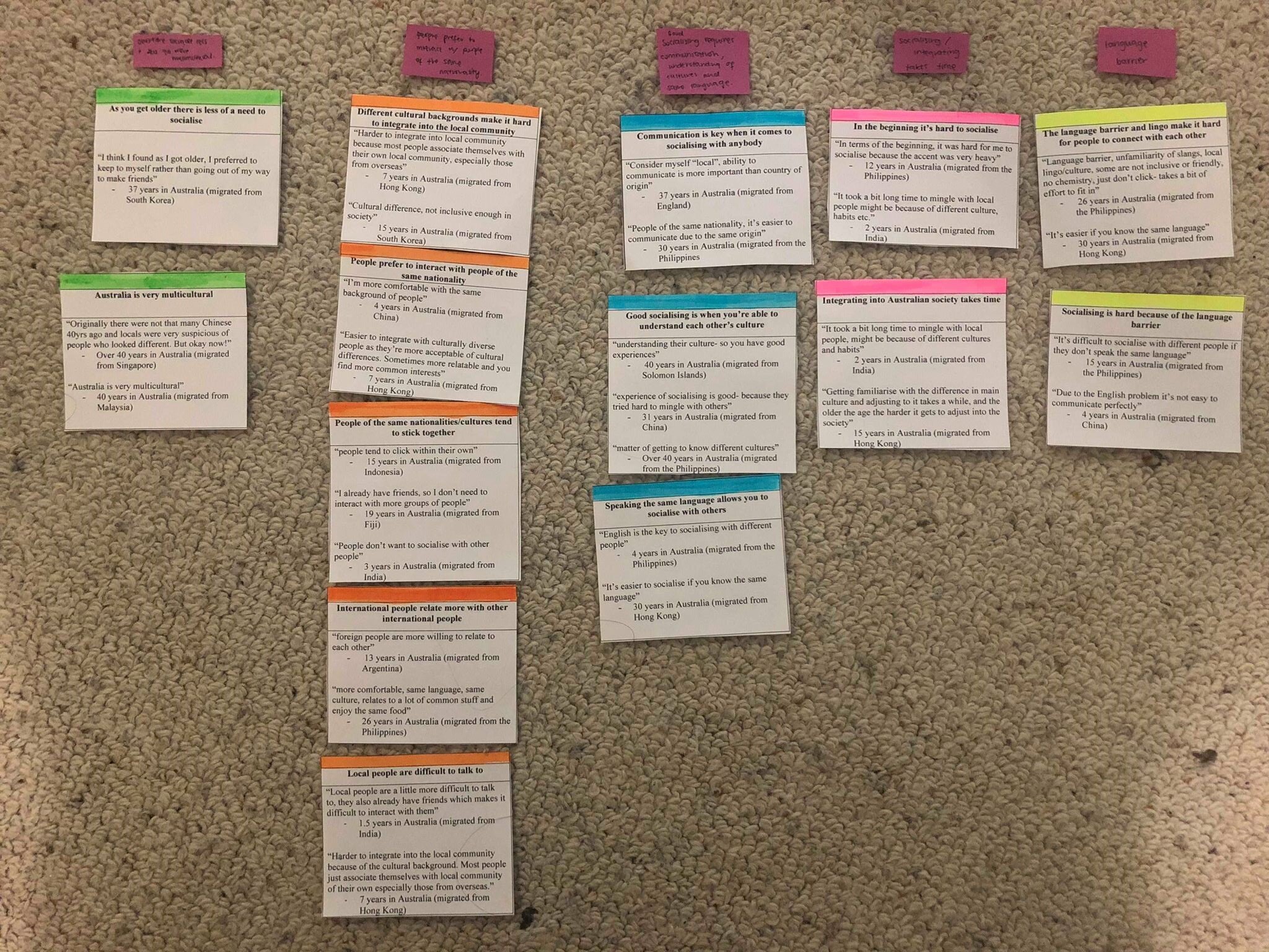
My survey received 60 responses and was delivered electronically with 14 questions. I received more of a range of people with differing ages, most being around the age of 36-60, I also had a wider range of where people originated from and how long they had been living in Australia with the longest being 40+ years and the shortest 1.5 months. Thus, the use of surveys was good as it allowed me to receive a lot of data in a short amount of time and with a larger range which gave me a lot of differing opinions and data to work with.
From my surveys I synthesised the data by using statement cards which helped me to make sense of the data and pull out key findings from it. First, I found key themes within the data and then I grouped the quotes together and made cards, after that I matched the cards with each other and came up with main themes/insights.
Contextual Observations
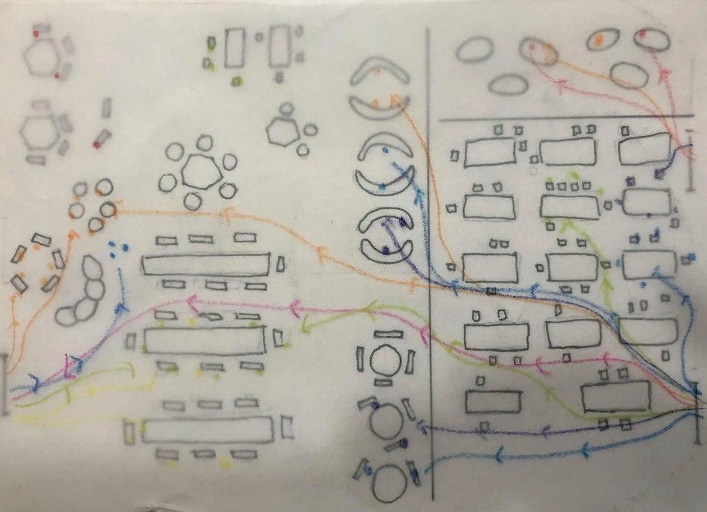
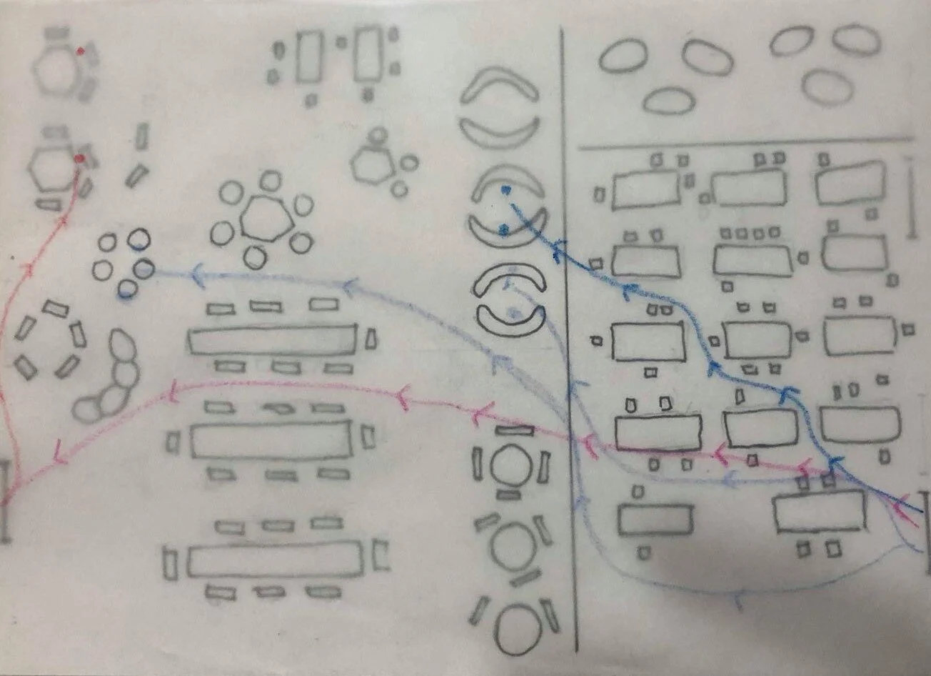
The third method that I chose was contextual observation which is used to study people’s behaviour in different environments such as workplaces, homes and public spaces. I decided to use it as it can reveal aspects of behaviours between the user and the context that I would not have been able to pick up on in an observation carried out in a controlled environment of a lab and can be used for developing a better understanding of the problem scenario.
Location: International Student Lounge (ISL) University of Sydney Camperdown/Darlington Campus
I chose this location because it’s an open space that contains couches, chairs and tables where people can hang out with their friends, microwave their food, study and weekly events are held there as well. Aside from the name the ISL isn’t only for international students everyone is welcome and there is a good variety of people who use the space. Thus, it seemed like the best place to observe people interacting with one another. It is also connected to classes where they have English learning services so there are a lot of international student walking through this space.
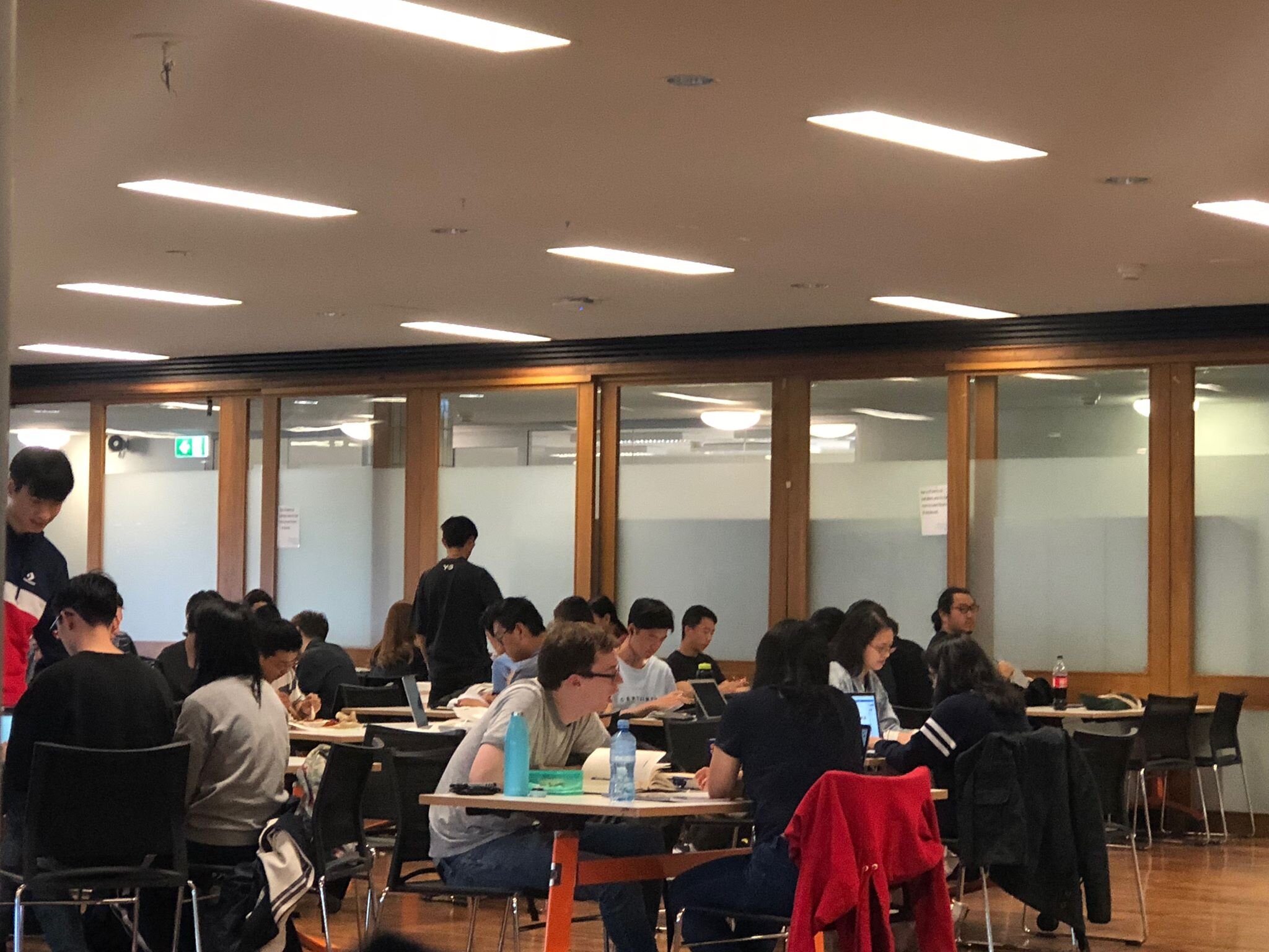
Things I looked out for:
People on phones, chairs, couches/bean bags (where, how long)
If they were alone, pairs, groups of people
What they were doing e.g. eating, sitting, studying, socialising
Who were they interacting with?
If they already knew the people, they were sitting with
What language they were speaking
Methods of Observing:
Photographs
Direct observation
Timing
Note taking
For contextual observation I mapped the human behaviour/ movement through space and time. This gave me a clear impression of how a space is used over time by multiple people and by individual users to see their how they interact with other people in the space.
Findings
And so, from these 3 research methods these were the key insights and themes that we discovered:
People were afraid of rejection and so they held themselves back
People preferred to talk to people of their own community/of the same nationality. Made it hard for some international people to feel accepted
Most people experienced a cultural dissonance between international people and local people e.g. international people didn’t feel included by the locals
Language barrier and difference in accents made it hard for people to understand and connect with each other
Socialising in a new country takes time and requires communication, understanding of cultures and the same language
Integration into a society is when you can relate to people and feel a sense of belonging e.g. some people have had bad experiences with meeting international people which changed the way they view international people.
Personas
From the findings we then created three personas to allow us to engage socially and emotionally with the needs of the users and help us to find the information that is most relevant to our design issue and will also help to convey different insights.
Storyboarding
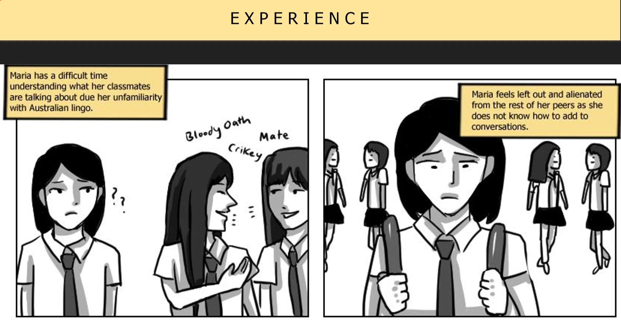
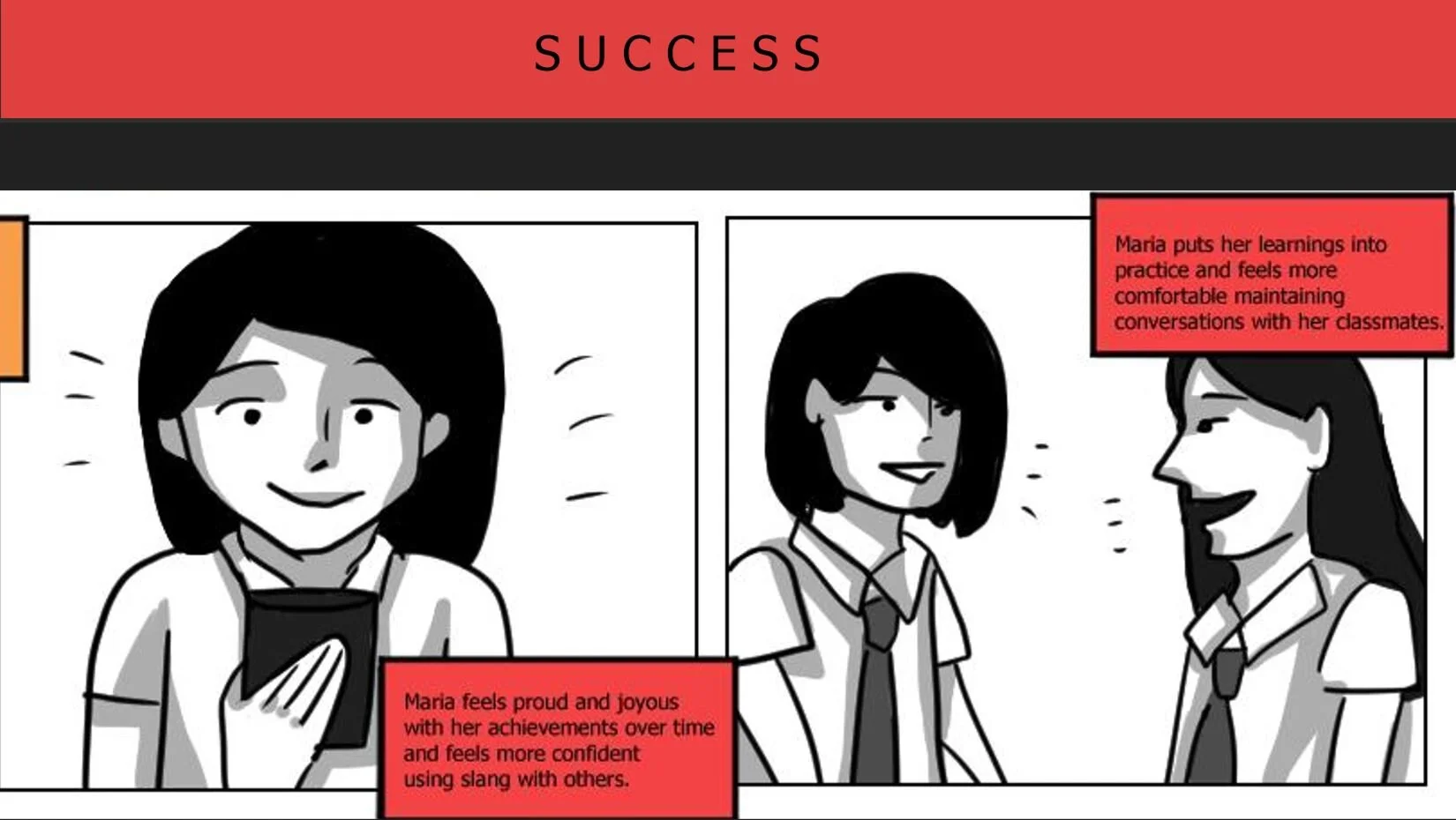
When storyboarding, the three main experiences that are currently being portrayed in the personas were highlighted. The first one looks at David who has already integrated into the Australian Society and made a lot of local friends however as Australia got more multicultural he started to drift towards the people of his own nationality as he has more in common with them. The second storyboard talks about Stacy who has just recently moved to Australia, however her English isn't very good and so she struggles to connect and find a sense of belonging in this new country. The final storyboard talks about Noora who want to make more friends outside of her friend group which is primarily international people and people of the same nationality as hers, however it is the other people who seem uninterested in making friends.
Criteria for Success
From all of our insights we then created a criteria for success, to ensure that we were all on the same page about what our design solution/product had to do. And so we can up with 6 criteria's and they were:
Has to allow people to understand each other better so they can relate to each other and form long-lasting relationships
Has to provide a safe space for people to interact so they don't have to be confident to be able to make friends
Has to allow people to understand each other's culture
Has to remove the language barrier between people
Make people feel included, a sense of belonging and community
Has to cater to all the main stakeholders
Ideation and Iteration
We then used design methods such as brainstorming and the crazy 8's to come up with ideas and solutions and we narrowed that down to 11 different design solutions that we liked. To help us decide on which solution to chose we then created a decision matrix. The yellow is indicating the highest points and the pink is indicating equal points.
From this we chose the 3 highest solutions, from the pink ones we just chose the one we like the best and then we iterated on that by asking for feedback and once our concepts were solid we created 3 different user journey maps.
Design Concepts
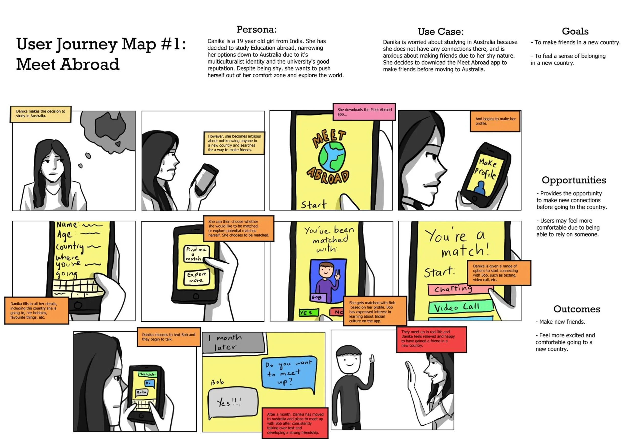
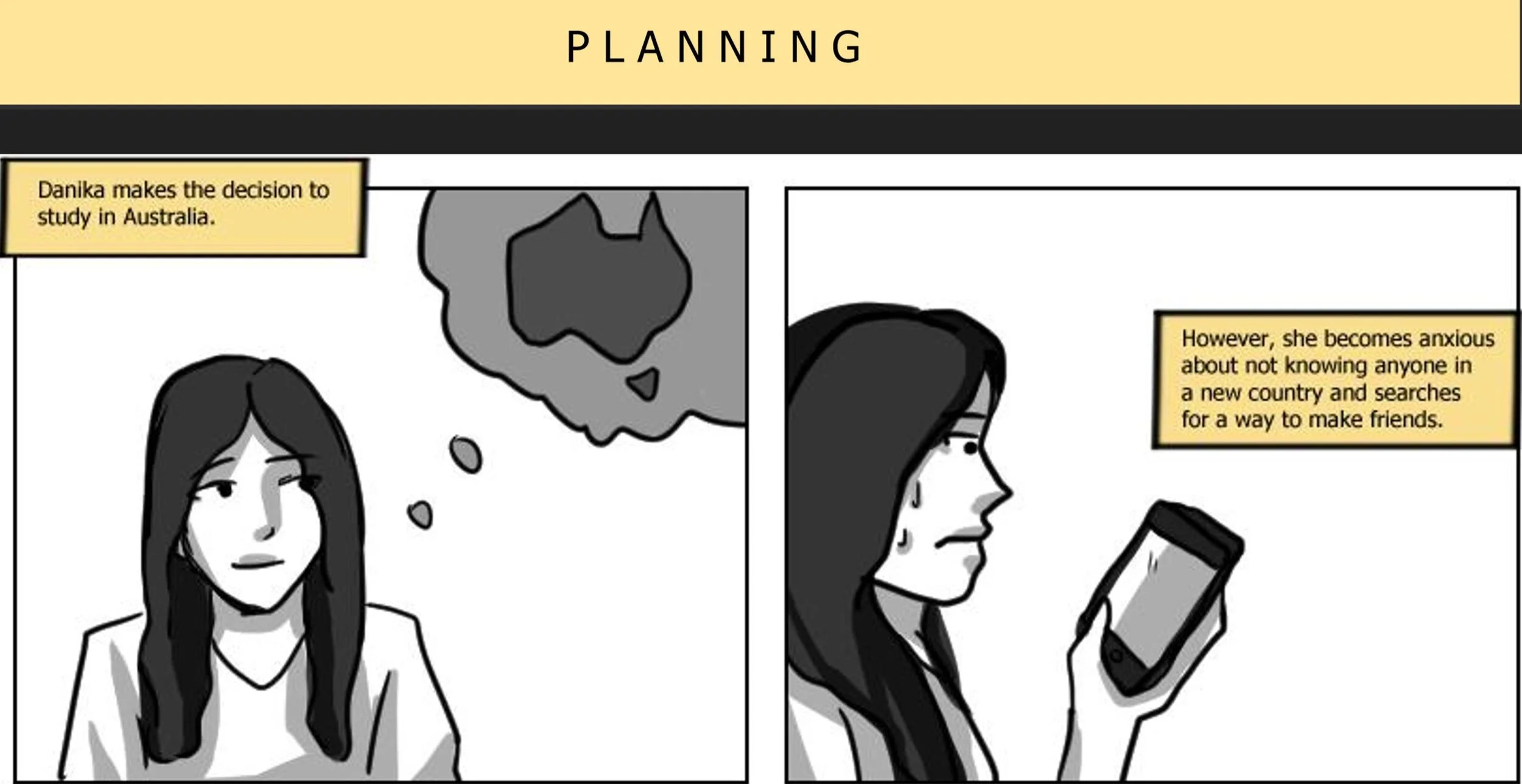
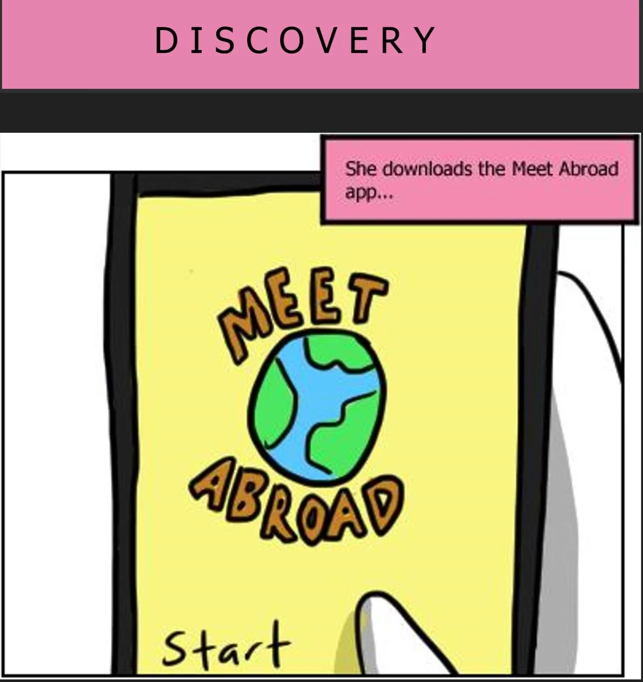
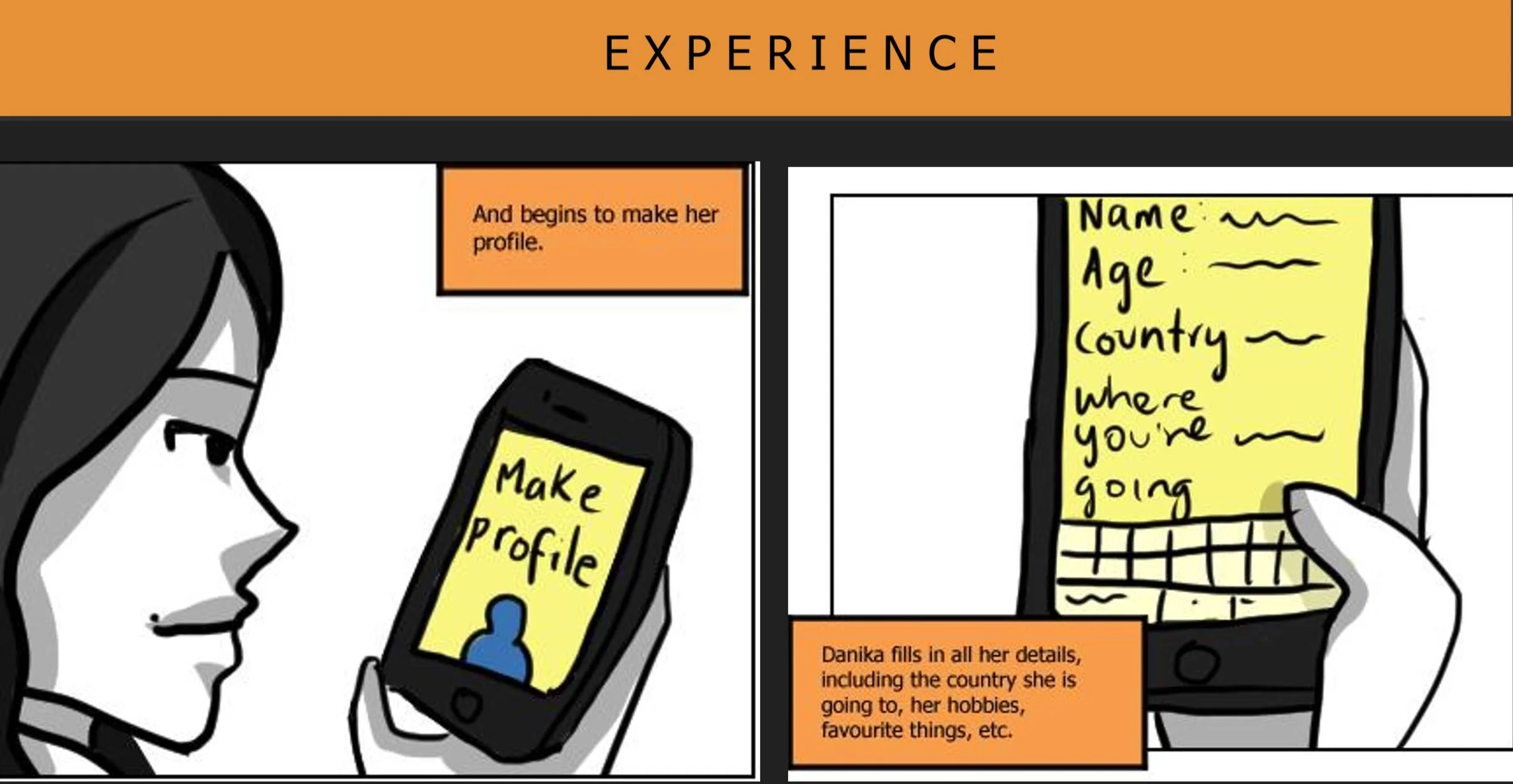
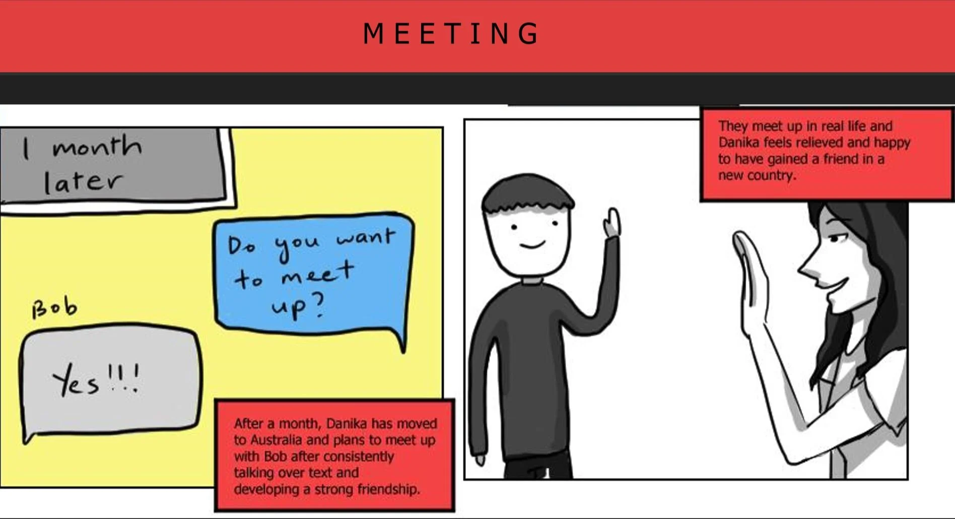
1.MEET ABROAD (exchange app: users can make friends before moving to a new country)
They can make a profile and list down interests/hobbies, and match with people who share common interests. Once they match, they can talk to each other and develop a relationship; get to know each other’s cultures etc and potentially meet up afterwards. Establishes familiarity and comfortability within new environment. It enables international people to form long lasting and substantial relationships with their peers even before moving to the new country by allowing them to interact before the meet. It provides a sense of belonging and allows user to feel comfortable and connected in a new environment .
Positives: Stronger foundation for friendships as you can interact before meeting. Global conversations due to in-built translator.
Things to improve: Finding the right people to form lasting relationships; it is not guaranteed that the person will be compatible. Factor of safety needs to be considered more, could potentially be dangerous.
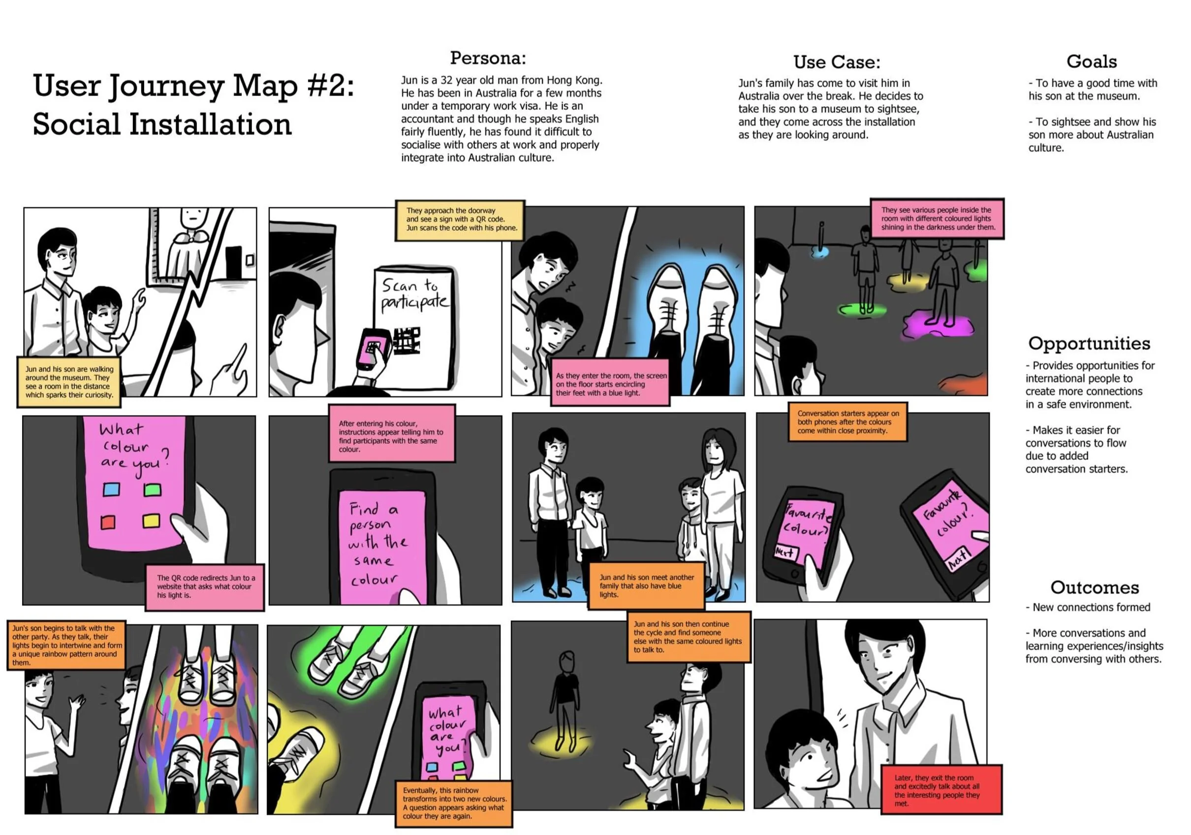
2. SOCIAL INSTALLATION (museum installation to help bring the gap between international people and local people)
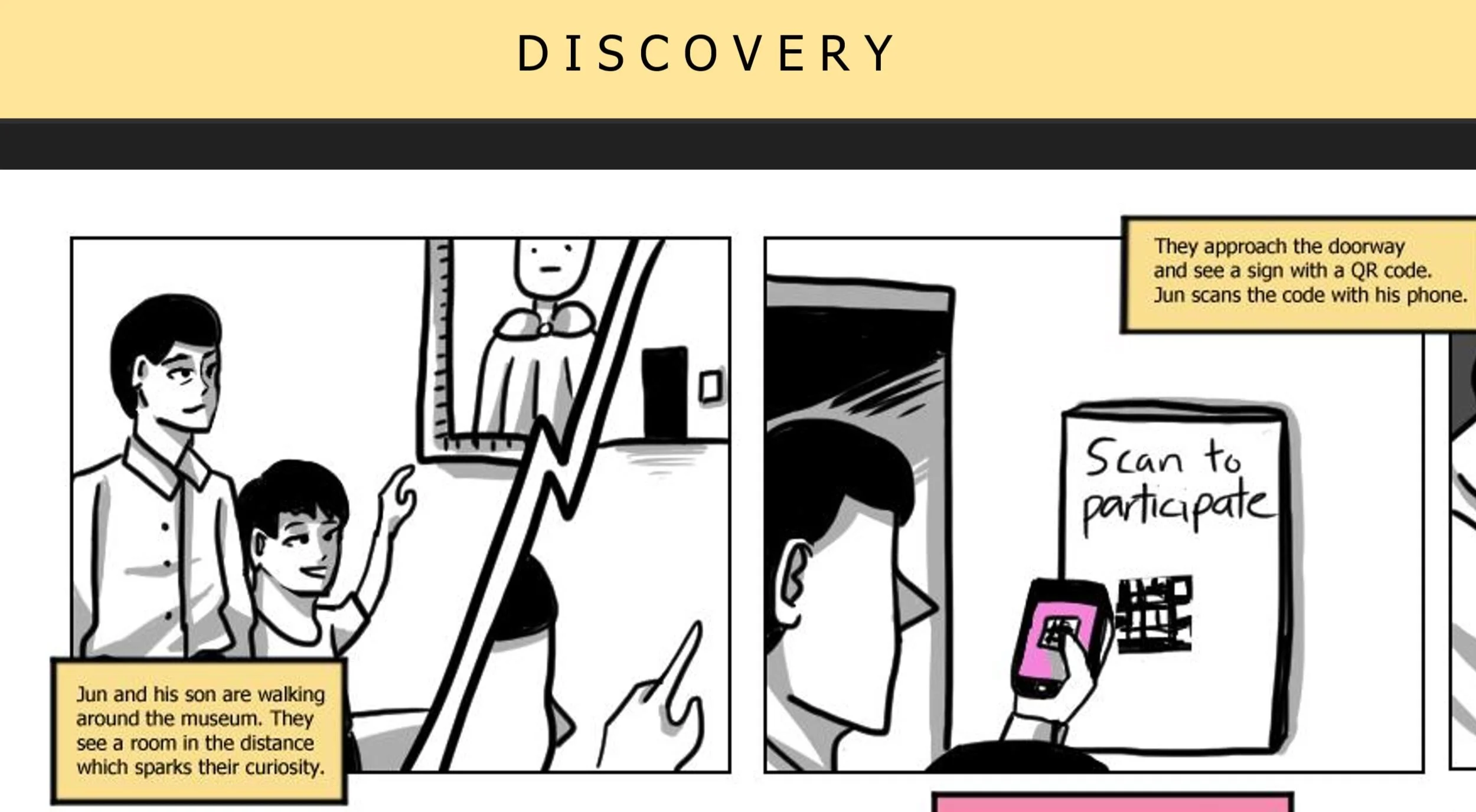
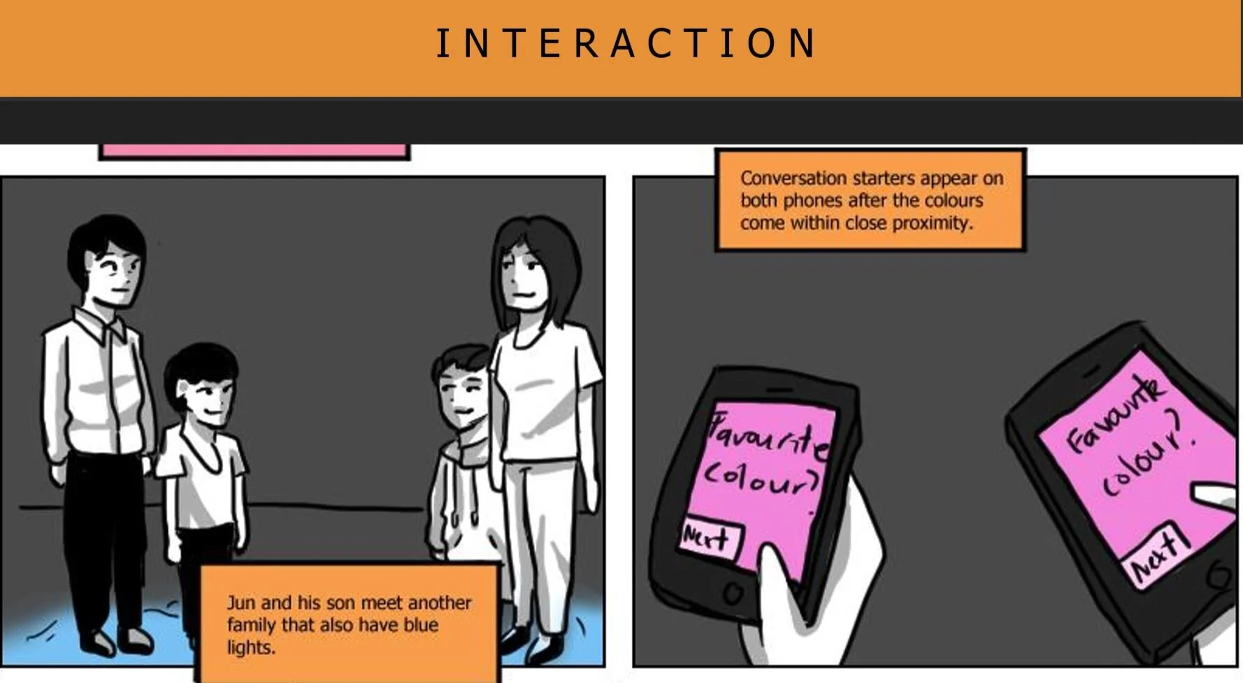
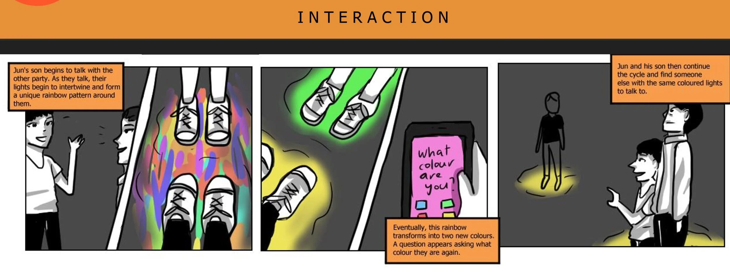
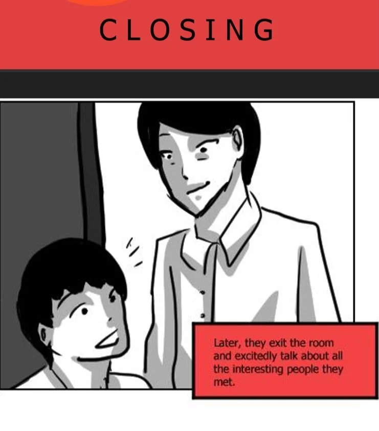
It’s an installation within a huge room. So before stepping into the room, users scan the QR code with their phone, they then enter a dark room; however the floor is a screen with sensors that create a circle of light that follows you. The QR code then asks you what colour you are and tells you to find someone with the same colour, it then gives you a question that you need to answer and when you chat with them, your lights begin to expand and intertwine together to form a cool unique light artwork thing. The lights eventually transform into two different colours and you repeat the pattern again. Our installation gets rid of the communication barriers by providing conversation starters in a safe environment and helps to form potential substantial relationships when interacting with the installation
Positives: Interactive, unique and fun → people can make connections without effort. Safe environment & comfortable conversations due to conversation starters.
Things to improve: Not screen feasible; not as appropriate for brief. Hard to develop and various complexities to consider.
3. SLANG APP (lets you learn new slang)
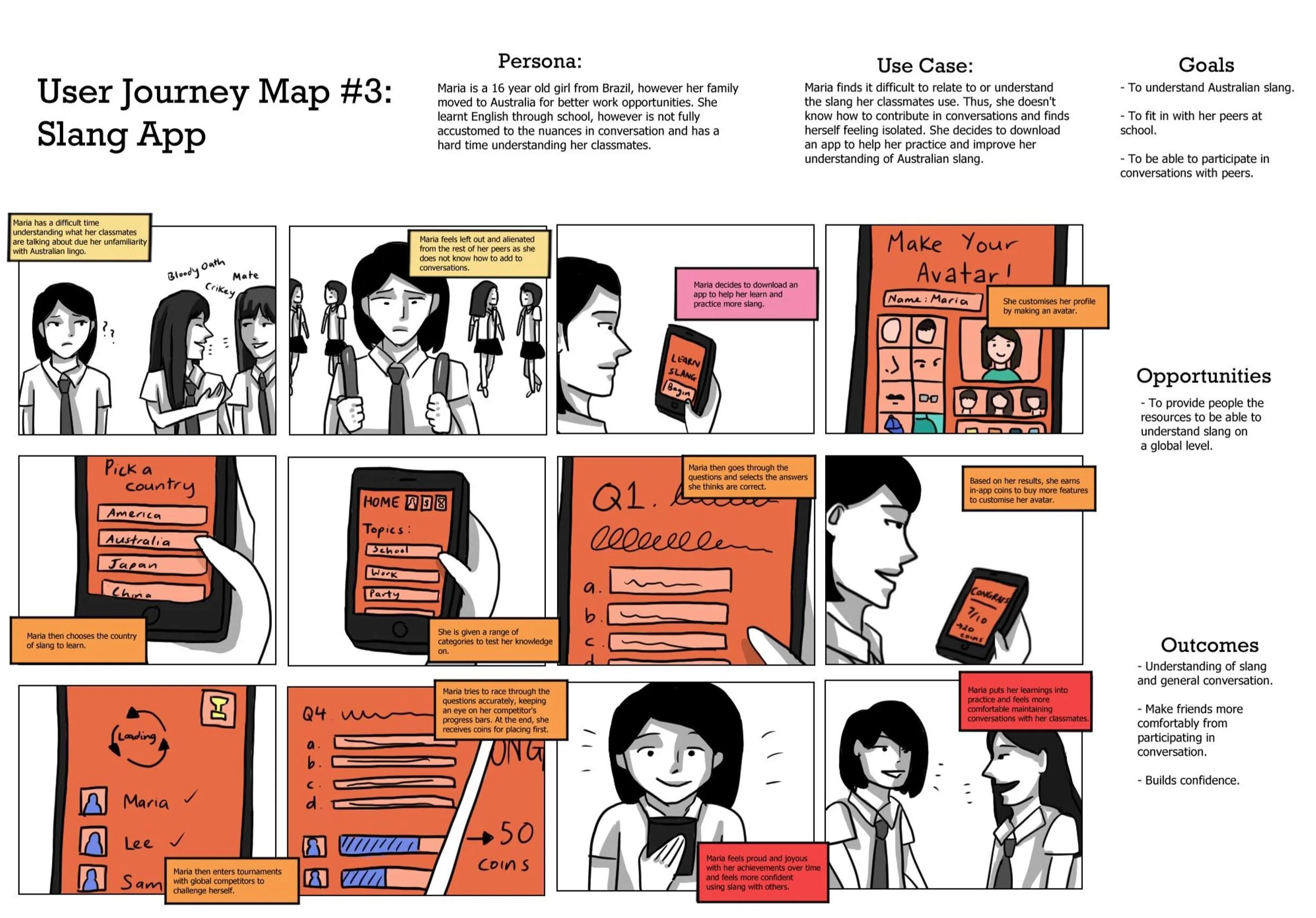
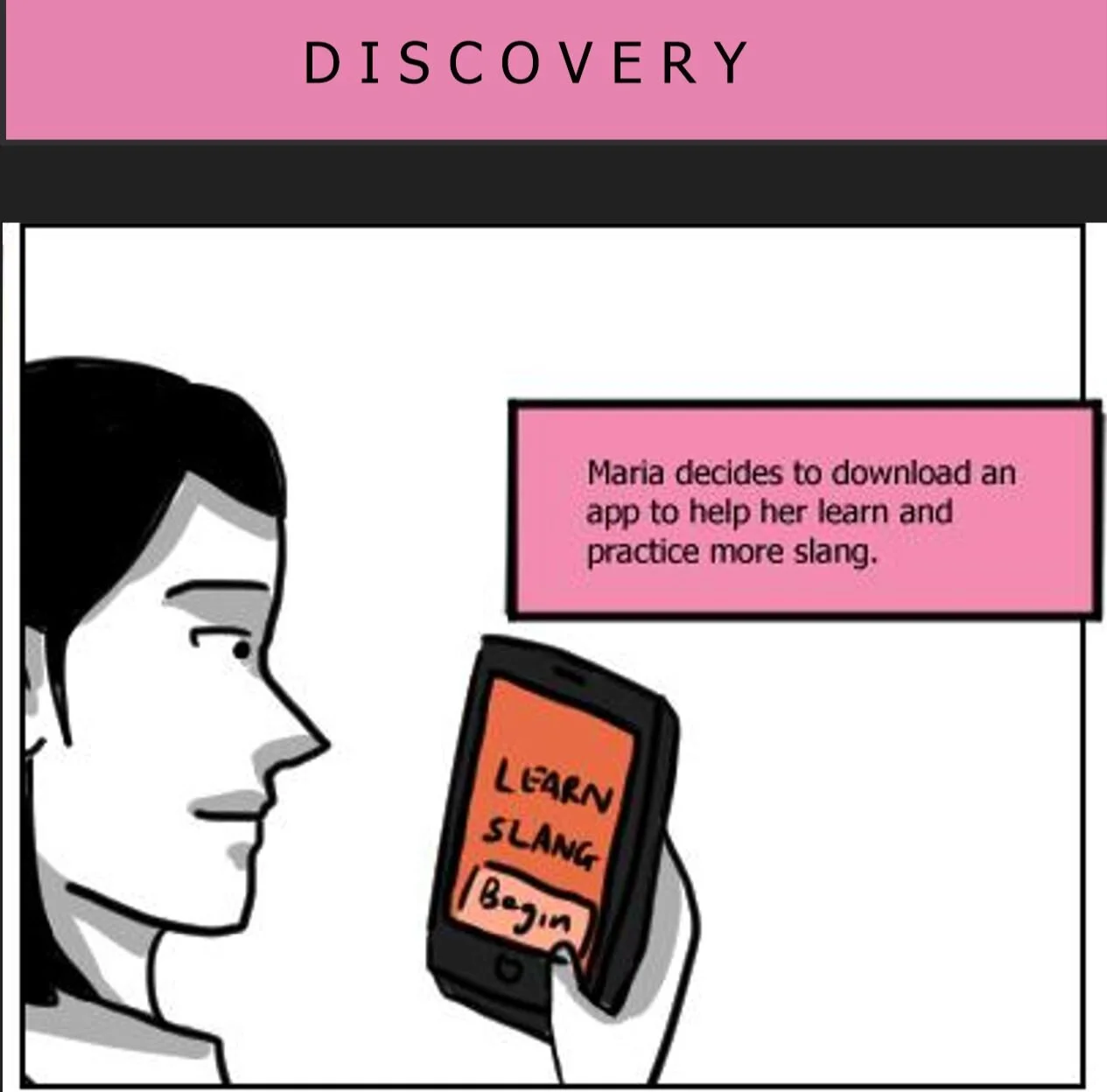
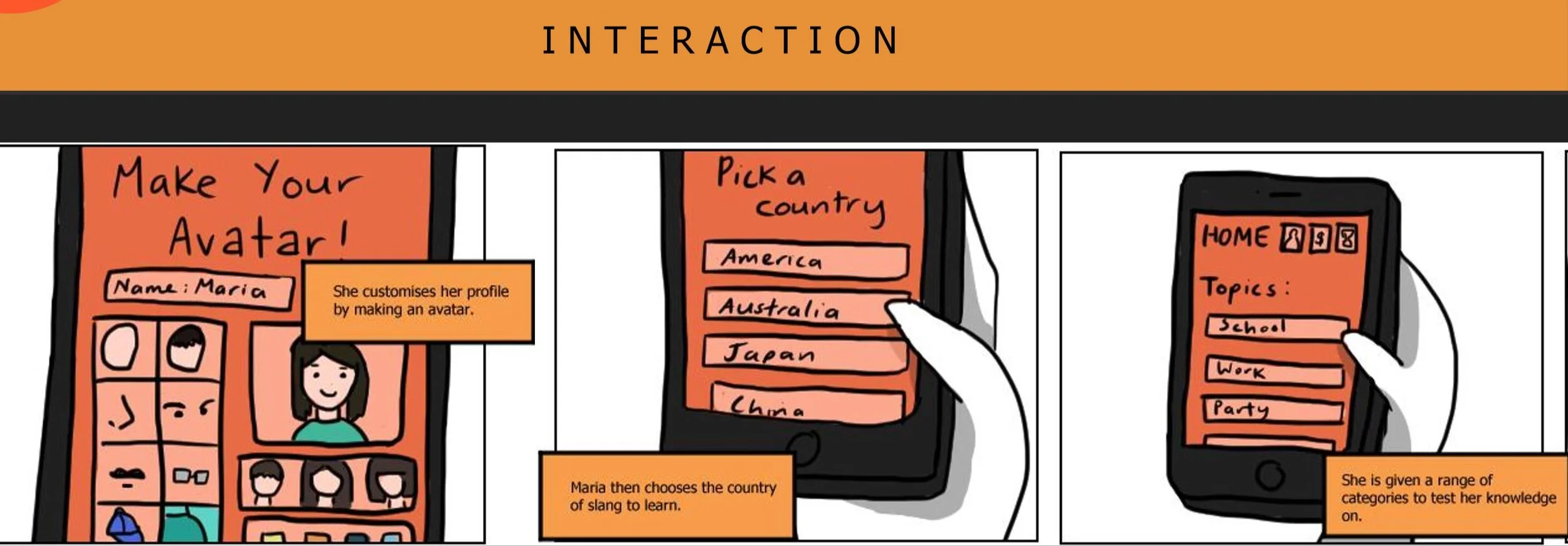
You start by making an avatar, and through engaging in learning slang from a country of choice you can earn in-game coins which add up and allow you to buy items to decorate or add to your avatar. You can also compete with other users to race through all the slang for added fun and extra prizes. This app reduces communication barriers and reduces the fear of asking what things may mean by providing a safe platform where people can learn and understand slang from all around the world. Thus, this allows both parties to be able to understand one another and form long-lasting relationships.
Positives: Gamification increases motivation and sense of accomplishment. Constant practice allows users to retain information.
Things to improve: Caters more towards a younger audience. Maybe need to add more incentives on top of more customisation for avatar.
Design Solution
From these three solutions we used process of elimination and decided that the Slang App was the least problematic and had the most potential. We also thought it was the most interesting one and were very excited to flesh our the features and so we decided to call the Slang App, Porkelingo.
It’s main feature will be the topics, where it will be split into two, first a tutorial and then a quiz, it will tell you your progress afterwards as well. You can also be in competitions with other people around the world or your friends to verse them in the slang. From the quizzes and the competitions you get badges and coins. You can use these coins to buy things for your Avatar, for example clothes or power ups to help you in the competitions.
Updated User Journey Map

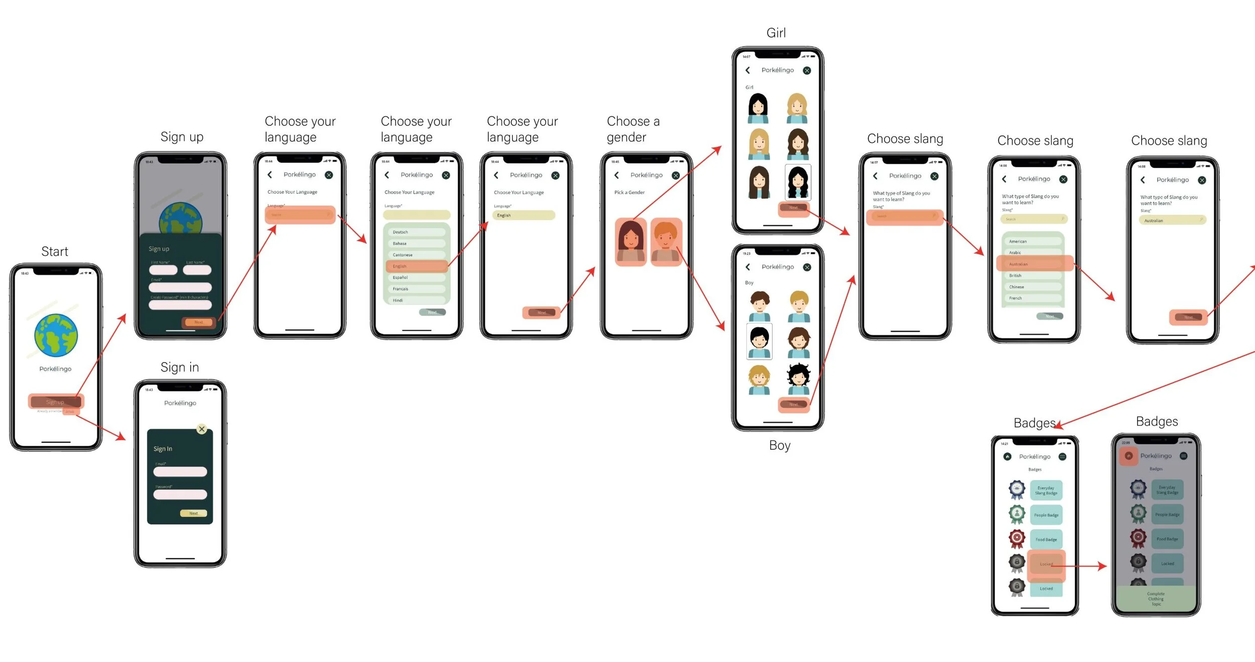
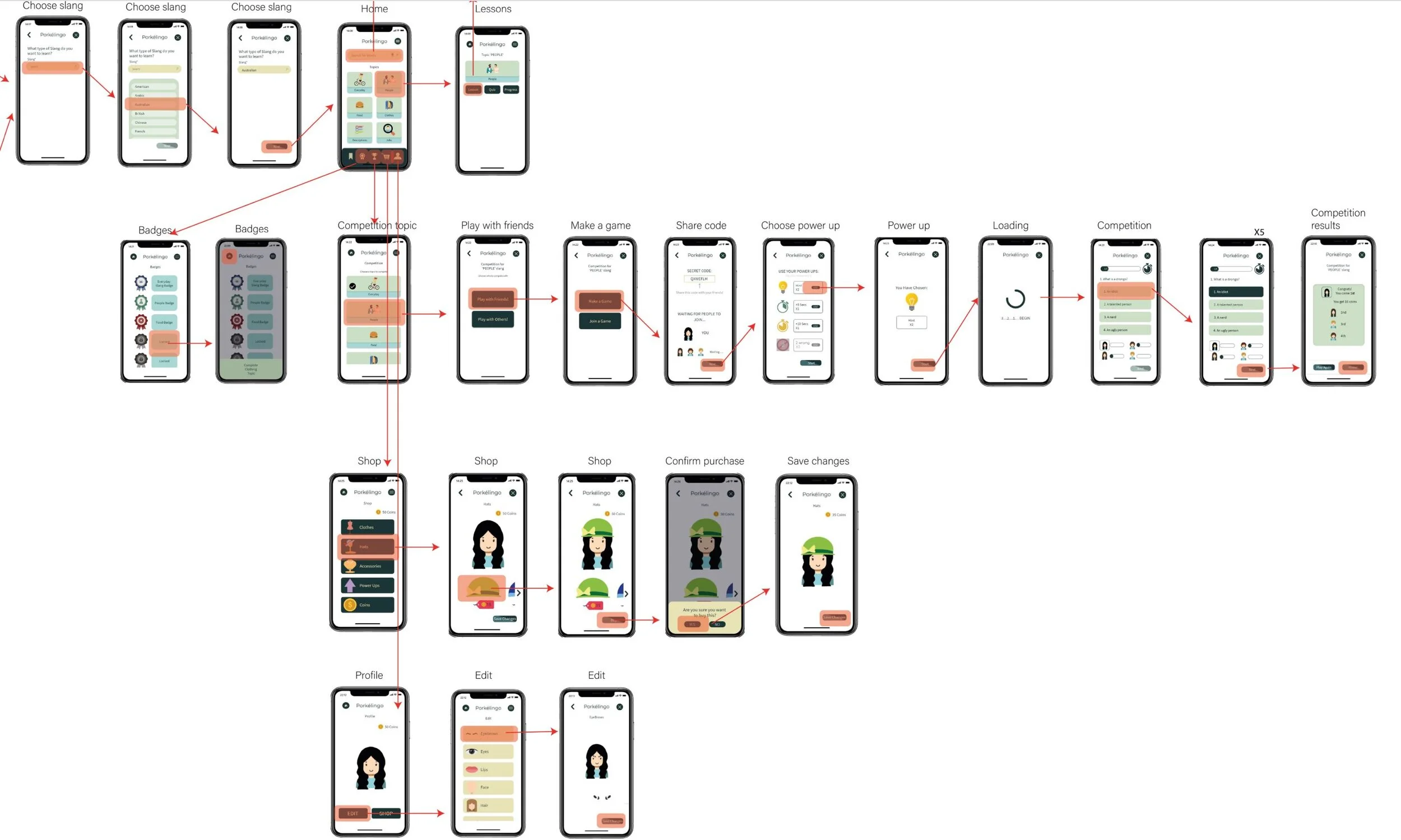
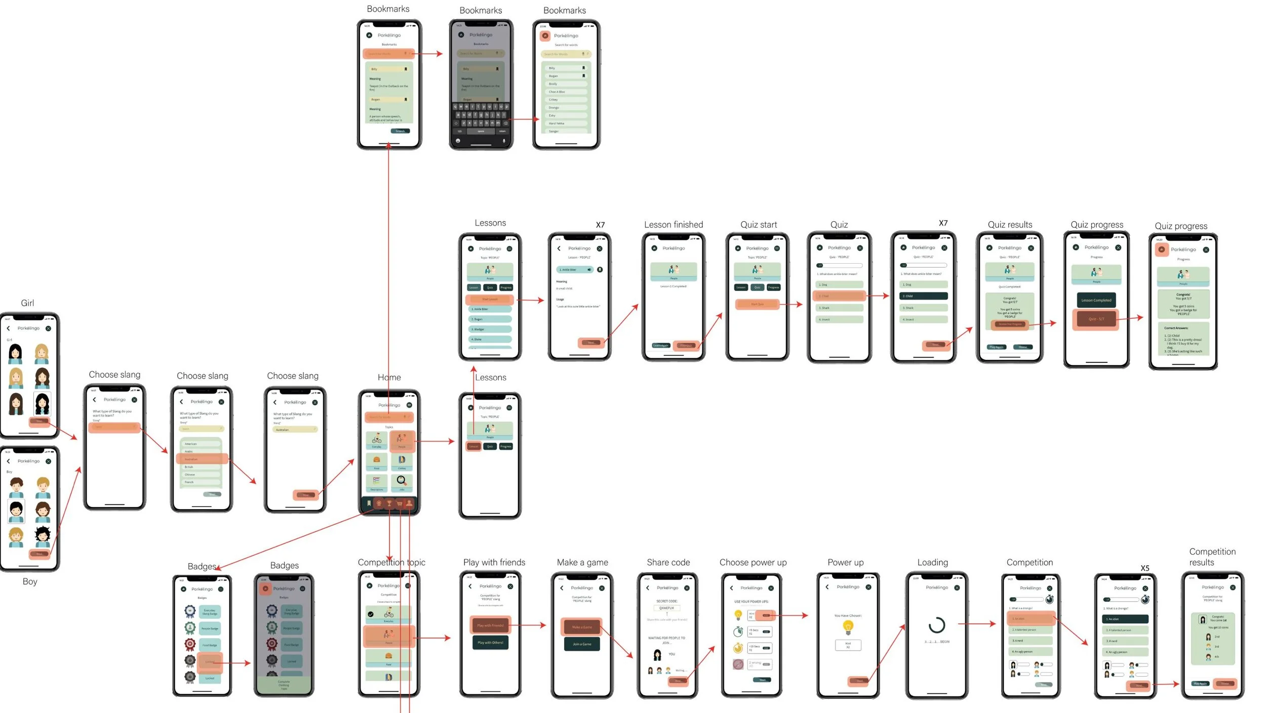
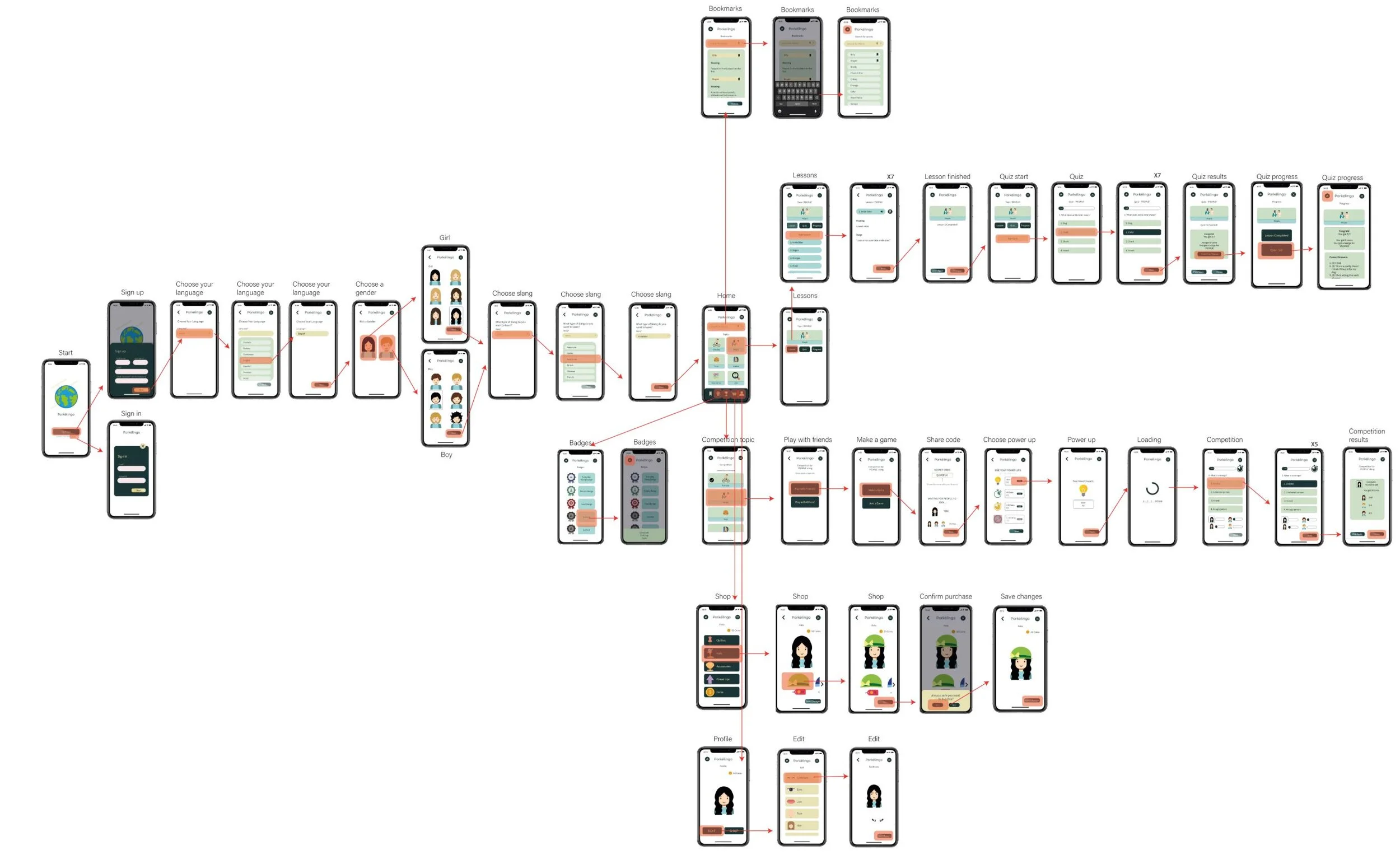
Flow Diagram of the application
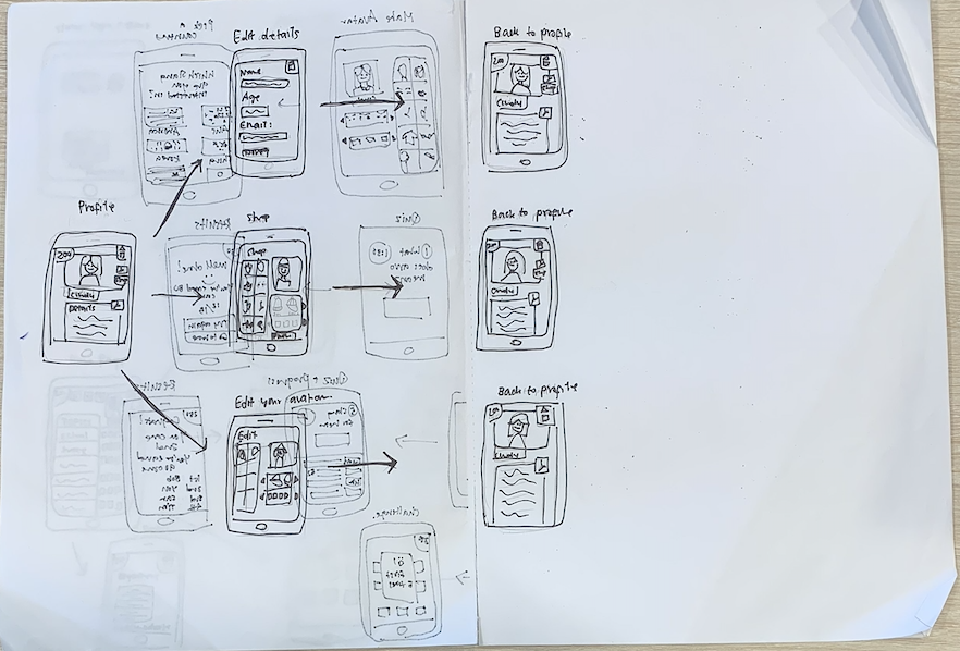
Sketches of application combined with the wireflow
Completed wireframes of application combined with the wireflow
Development, Testing and Evaluation of Low Fidelity Paper Prototypes
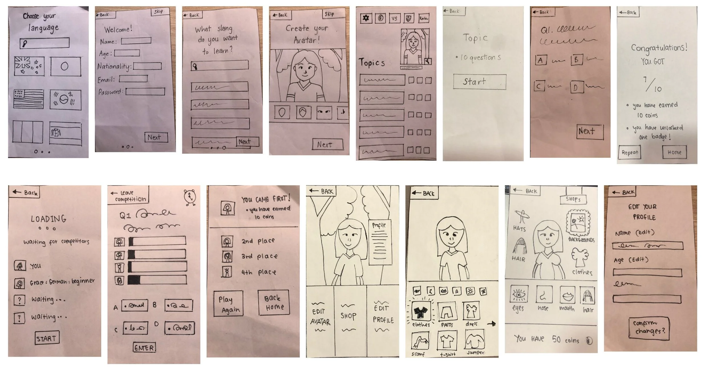
First we each sketched out how we wanted the main screens to look like and then we went around in a circle and critiques each one. Using this feedback we created one main sketch with all the features we wanted to include- considering various aspects of the usability heuristics, such as the visibility of system status as depicted in the progress bar of the competition. This became our guide when making our first paper prototype.
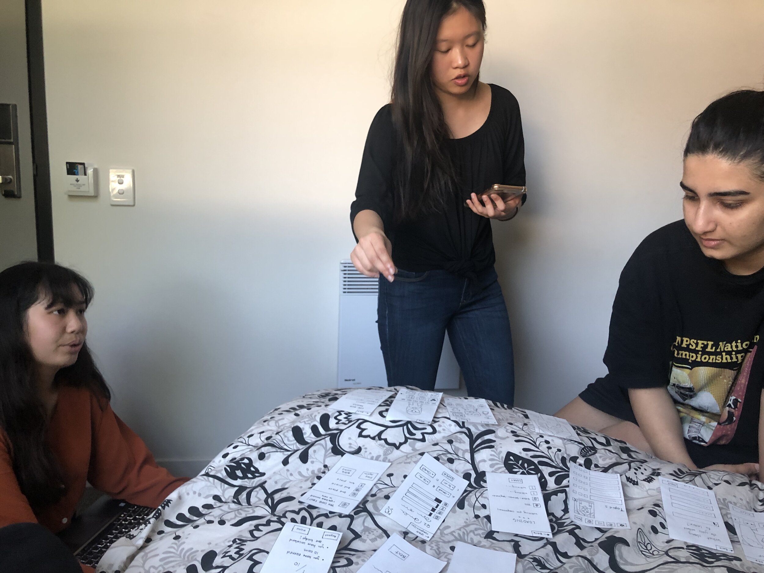
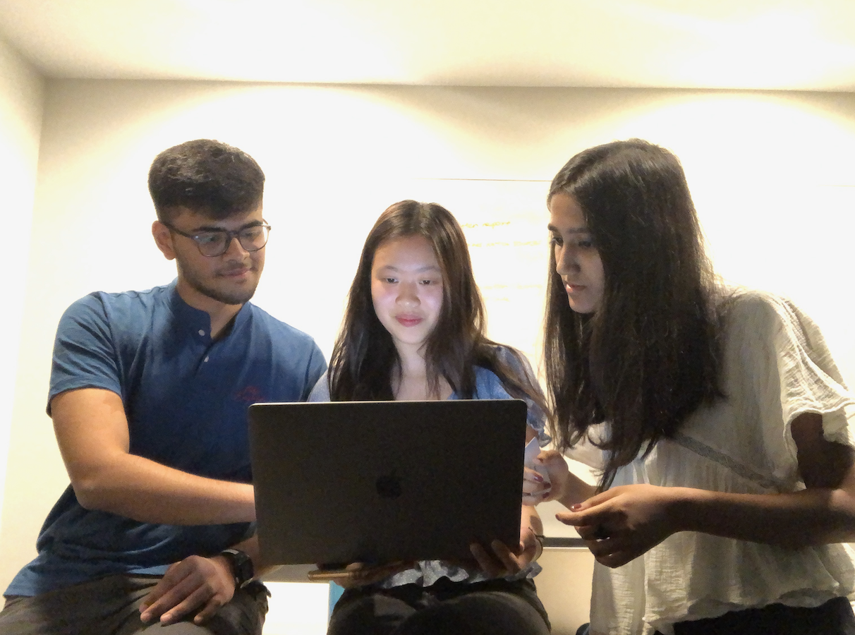
When user testing our first paper prototype we interviewed 12 people, ages 15-25. We decided to conduct an interview with warm up questions at the start, this then led into the 3 methods we used for user testing:
Think Aloud Session
Observations
Interviews
Paper Prototype Round 1
User Testing Round 1
From the User Testing and also using the design methods of Criteria for Success and Heuristic Evaluation, the main feedback was that the homepage was unclear, there were no home buttons and make ‘what slang do you want to learn’ more clear. The heuristic that was violated the most was consistency and standards as people were confused about the language page as most apps don’t split English into Australian English and American English and the submenu as they didn’t recognise the icons. Error prevention and User sense of control and freedom was also violated as users could not go back to change the slang which meant that if they picked the wrong one they wouldn’t be able to fix their error. And lastly, visibility of system status and feedback was also violated as most users were unsure of what the home page was because there was no indication that it was the home page.
Thus, some suggestions that we thought of were adding a loading page before, or a nice ‘welcome to your homepage’ title to make the homepage more obvious, adding a back button or having a ‘change slang’ button on the homepage and writing titles under the icons.
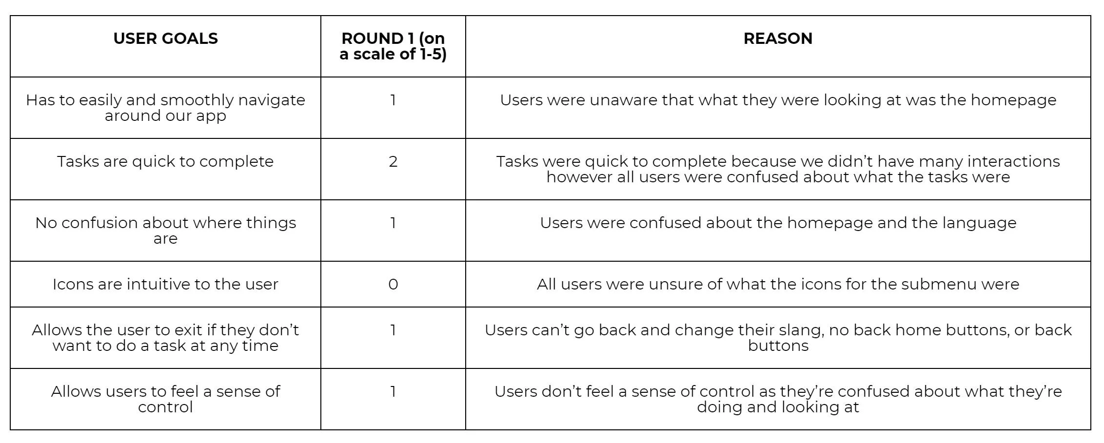
From our criteria for success we can see that they’re mostly 0-2 indicating that the users had a hard time using our app.
Paper Prototype Round 2
User Testing Round 2
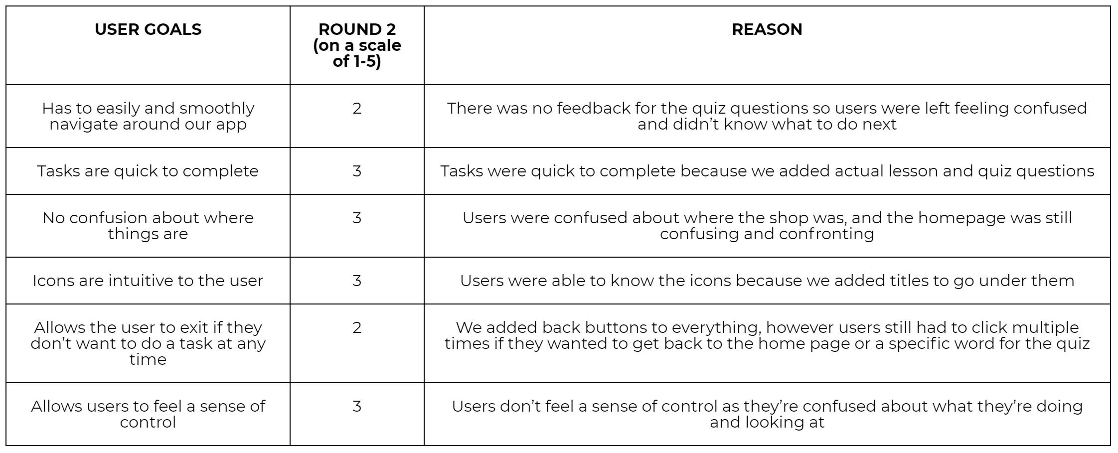
From our second round of paper prototypes we interviewed 12 people again ages 15-25 and the main feedback was that we gave the characters names- but they were confused about if that ha to be their name from then onwards, they didn’t know how to pronounce some of the words, and the homepage had too many colours, icons and was too confusing and confronting.
From the criteria for success, we can see that we needed to add feedback for the quiz questions, make the shop more accessible, and add more home buttons.
The main heuristic violated was visibility of system status and feedback because the quiz questions did not show if you clicked the answer or not, so users were left unaware and confused over their answers. The homepage was too crowded and there were too many options, which overwhelmed the user and made it hard to find everything. This in turn also restricts user sense of control and freedom as it makes it difficult to figure out what can and can’t be done. Finally, aesthetic/minimal design was violated as the avatar name confused people and was deemed irrelevant information to most users.
Some suggestions for improvements include adding a cross or tick next to the chosen quiz answer. Minimising the amount of content on the homepage could also reduce clutter, such a the 3-bar icon and avatar name.
Development, Testing and Evaluation of High Fidelity Prototypes
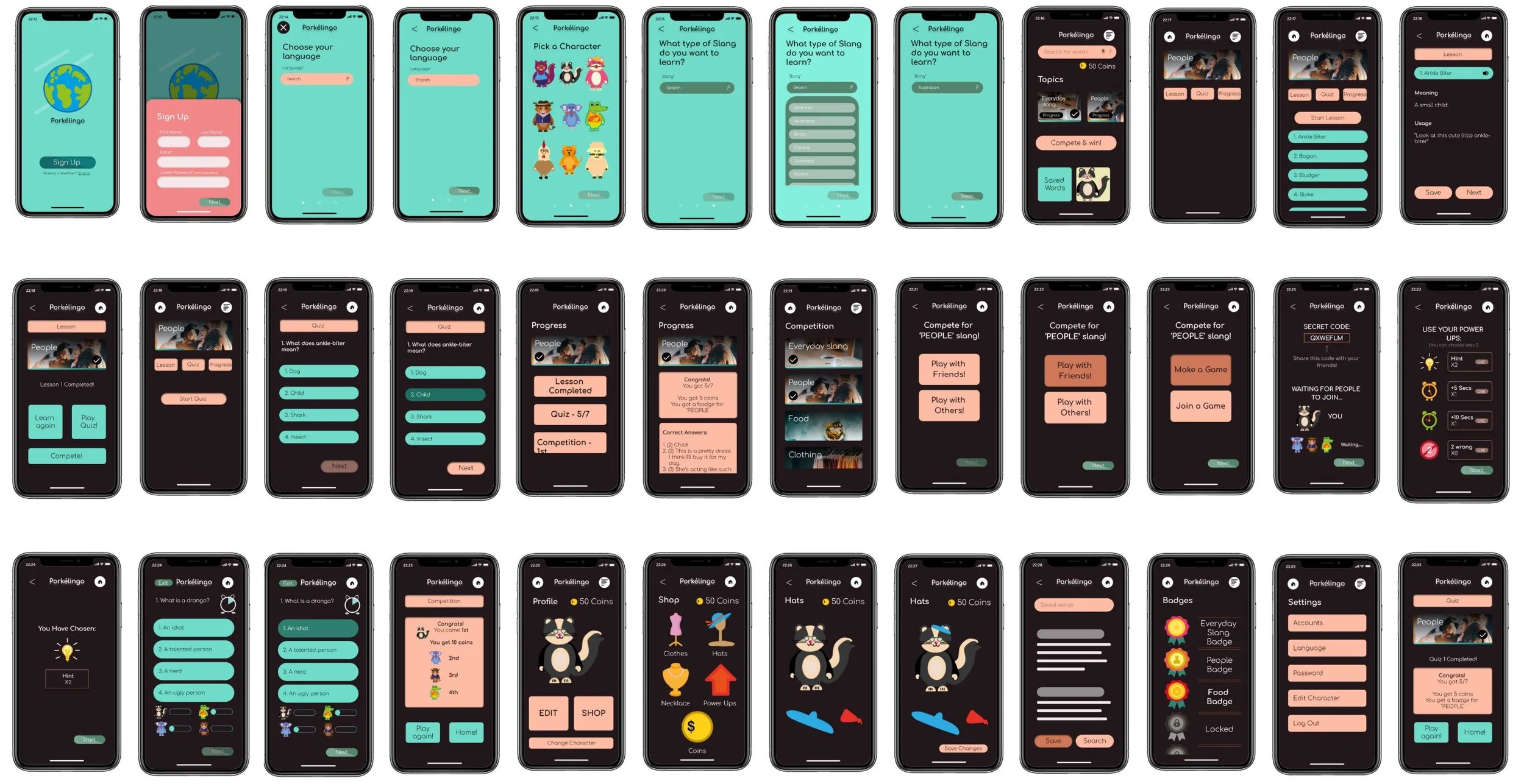
For round 3 of our hi-fi prototype, we used framer and interviewed 12 people. We then noted down feedback and insights to iterate on our next round of user testing.
High Fidelity Prototype Round 3
User Testing Round 3
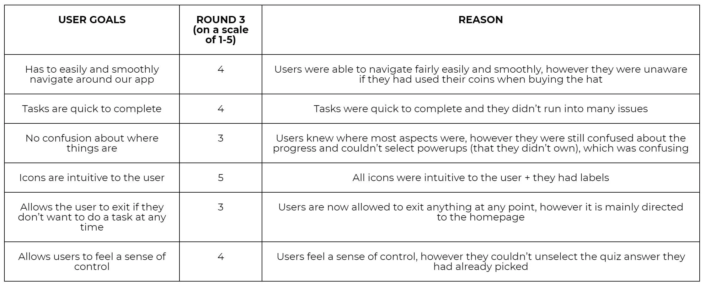
Our main feedback that we received was that for the competition we should make it clearer on who’s coming first, we need to mention the prices for the items in the shops, and users could not choose powerups they didn’t own. From the Criteria for Success we can see that the heuristic that was violated was mainly the visibility of system status and feedback. This was due to three main points:
They user was unable to select power ups (that they don’t own). They were unaware of whether they could click on power up and add it, which made them confused about whether they owned it.
They could not change their answer from the quiz questions.
Users were also unaware of whether or not they used their coins after buying the hat.
Suggestions included lowering the opacity for the power ups users didn’t own and changing the colour to grey. There should also be an option to select and deselect all questions and add a confirmation page after buying something.
High Fidelity Prototype Round 4
From the feedback these were the improvements that were made:
Placed a border around the user’s character in the competition to clarify to the user. Added an arrow for the hats so users were aware that there were more options. Recoloured unowned power ups to grey to make it more obvious. Placed price tags on the items of the shop. Added confirmation buttons for the purchasing of an item in the shop
User Testing Round 3
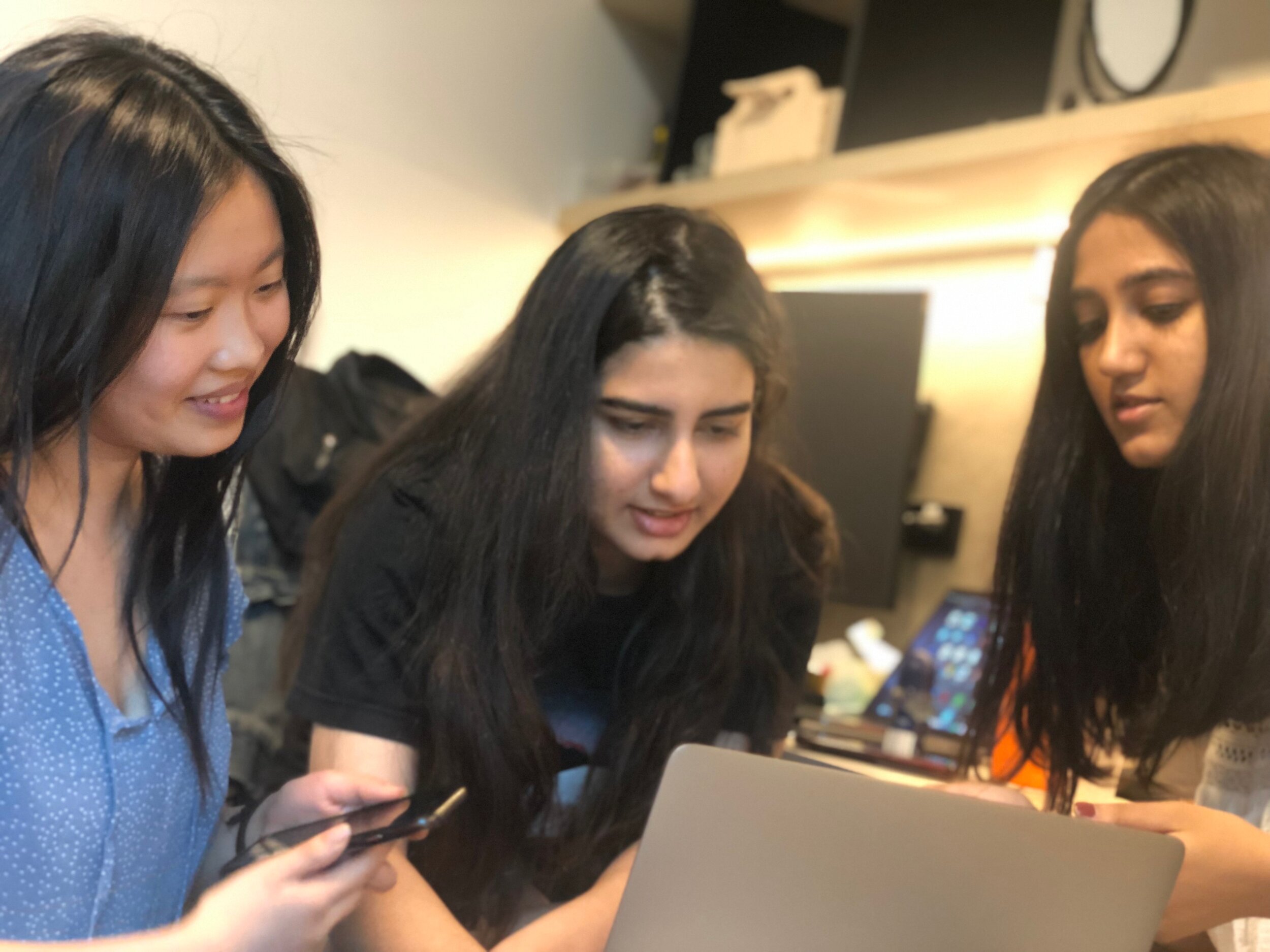
We then conducted another round of user testing with 12 people and received feedback which was that the symbol of shop and coin was confusing, the transition from the lesson to the quiz was not as smooth and they wanted to see their progress to see what question they were on. We also decided to rethink our UI design as there were various aspects that could be improved, such as consistency in colours and fonts. Despite our user testing and feedback from interviews, we failed to realise that our UI design was lacking visually. We decided to change our colour palette and font to a simpler one, to make the icons more consistent flat images, change the layout of the homepage and add a navigational bar.
High Fidelity Prototype Round 5
User Testing Round 5
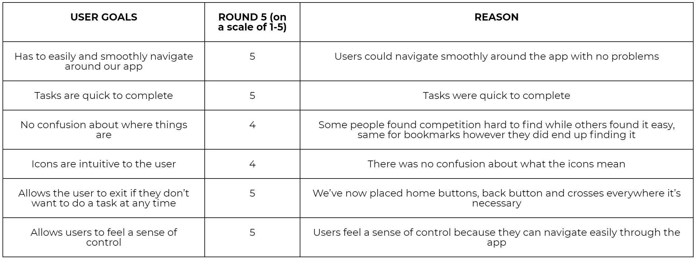
For our last round of user testing what we wanted to find out was if people liked our UI design and if they could still use it as efficiently as before with the changes we had made to the overall design of the app. We user tested 5 more people with the feedback being that all of the people we user tested found it super easy to navigate with them saying “The interface is very simple and easy to figure out, I like how some are just very complicated to use but yours is really easy,” and “ it’s simple to go through and navigate.”
From our criteria for success we can see that they’re mainly 4 and 5 indicating that the users were able to use our app effectively. And users also commented on our UI design stating that they ‘liked the bright colours’ and that it ‘looked a lot better now! More professional’.
Video walk-through of the design solution in action
Promotional video of the design solution
A proposal for the next steps
Reflection
Upon reflecting on our project, there are various things we could improve upon further exploration.
Interviews could be more consistent. Some individuals gave more in-depth answers in comparison to other users, who were restrained by limited time or were unfamiliar with usability testing. As a result, our interview data and insights varied greatly. Moving forward, we could ensure participants are fully aware of the amount of time needed for the interview, as well as giving them a more thorough understanding of how usability testing works.
Varying participants could be used per round. We used some recurring people during the rounds, which may have affected our insights and data. Participants know what to expect during the tasks and are more clued into the interface each round and therefore skews the results.
There should be a solid briefing of what the ‘think aloud’ method entails. People generally are not used to doing tasks while thinking aloud, as well as having others watch them. We found that during our testing, some users tended to stop speaking or forget about the think aloud method during the tasks, which limits our understanding of their thought process. Thus, emphasising ‘think aloud’ and reminding users during the course of the testing could be beneficial in further exploration.
Ways Forward
Looking to the future, Porkélingo aims to improve and expand its features. For instance:
It could incorporate more game-like features besides the competition aspect. For instance in games like Brain Age, there are various mini games and exercises which provide more dynamism in tasks and keep users interested.
More trials and tests should be conducted on international people using the app over a period of time. This should be done to gauge the effectiveness of the app over the long term, and whether it retains user interest and improves their understanding of slang.
Adding levels of difficulty would allow more options for users instead of grouping them into a standardised played. This could also allow users to feel more comfortable with the levels they are at and receive appropriate questions.
