Wayfinding at Vivid Sydney
UX Design Project

Wayfinding at Vivid Sydney
Team: Kimberly Chan || Macy Chong
Timeline: 12 weeks, 2019
Role: User researcher, conducted context-mapping study and sensitising activities, videographer, prototyping
Tools: Sketch, Photoshop, Premier Pro, illustrator
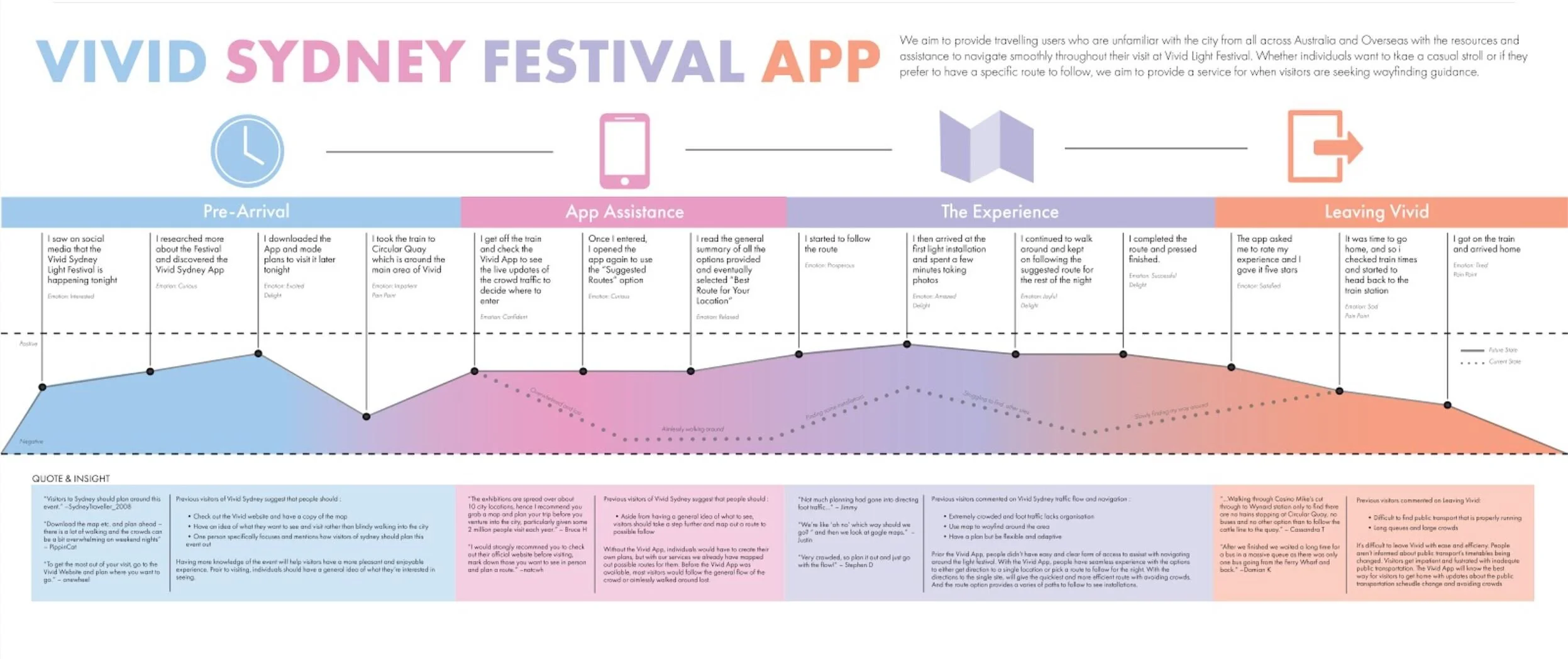
Redesigning the visitor experience depending on their level of skill and the way they want to approach wayfinding at Vivid Sydney, our design solution (Vivid App) caters to all users, weather they prefer planning their visit or if they prefer to independently navigate. Our solution helps to make their experience less stressful, more enjoyable and seamless as they are allowed to navigate through Vivid in a flow state where they’re completely involved in the moment.
Vision
We aim to provide travelling users who are unfamiliar with the city from all across Australia and Overseas with the resources and assistance to navigate smoothly throughout their visit at Vivid Light Festival, thus providing a low stress, more enjoyable and memorable time at the festival.
Context-Mapping Research Study
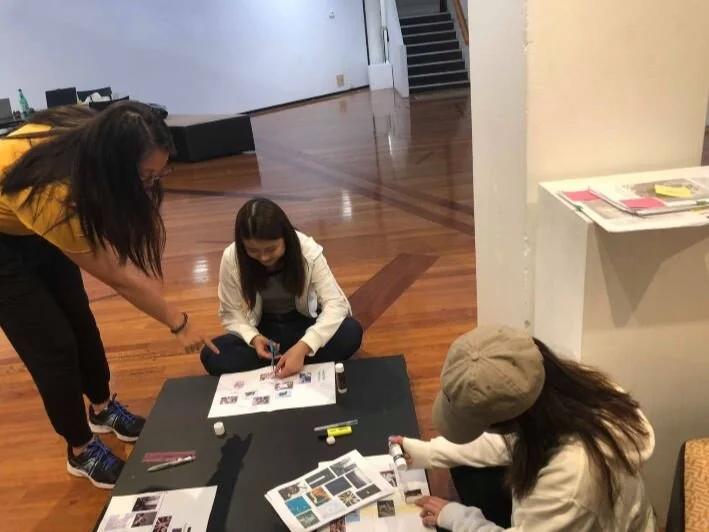
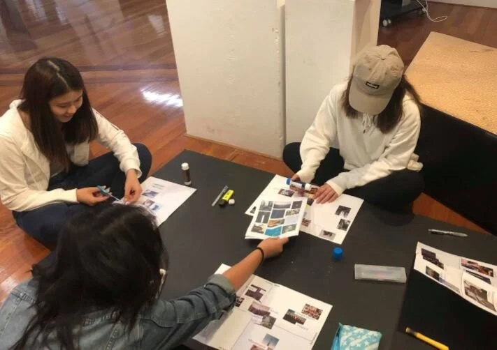
In order to understand our user’s experience we decided to conduct 2 sessions of a context-mapping study with 4 participants in each so that we could identify the key insights and begin to frame our users needs.
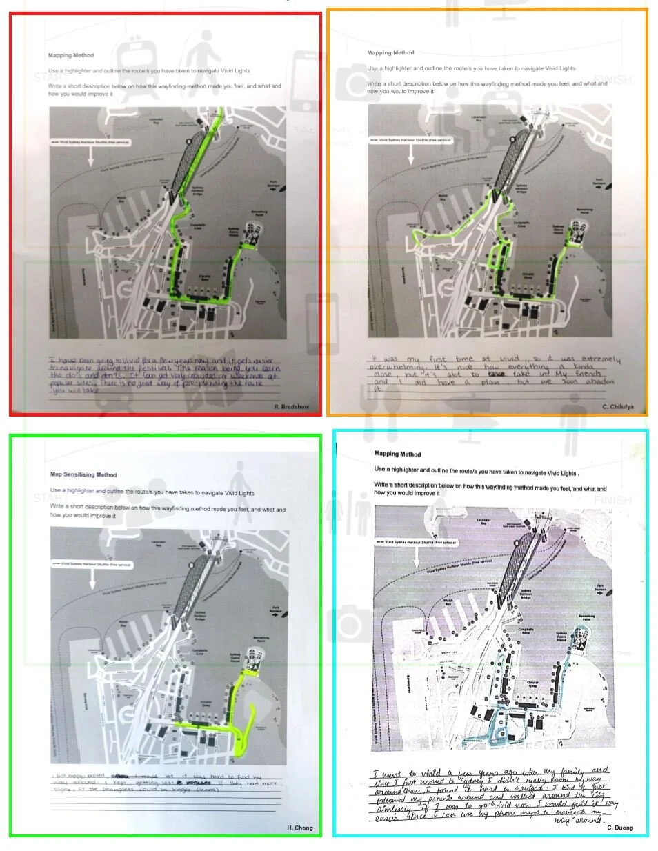
Sensitising Booklets
Firstly we conducted a series of sensitising exercises to prepare our participants for the context-mapping.
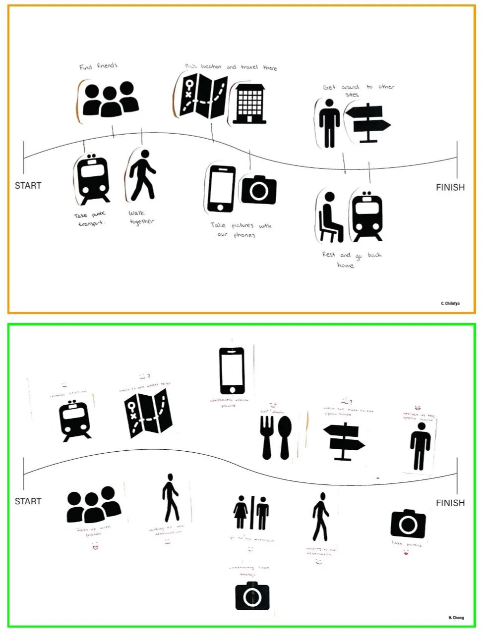
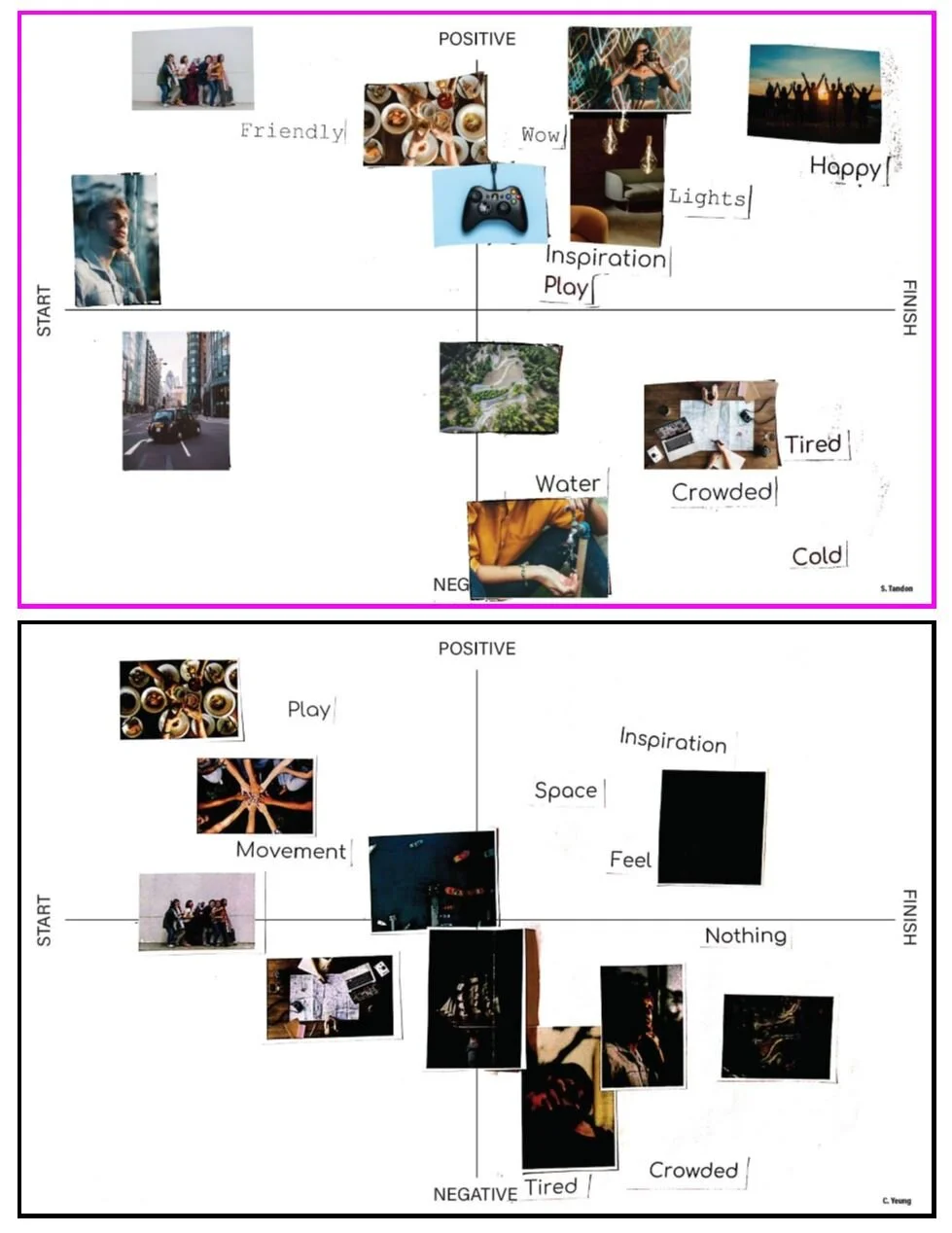
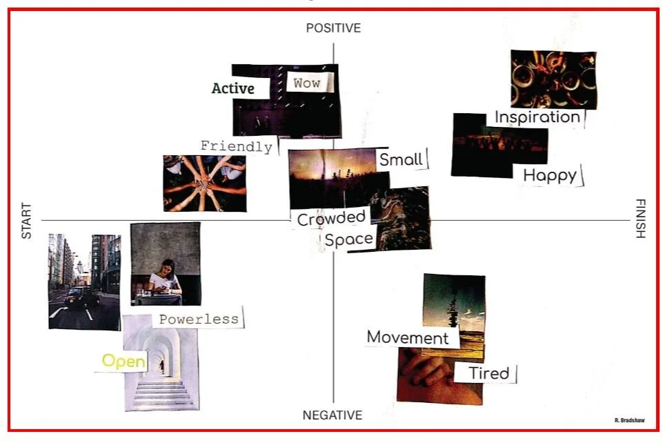
We then moved on to the Context-Mapping where participants were given collage making tasks, and using the images and text provided they were asked to create a collage or timeline based on their previous vivid experiences. This was then followed by an interview/ questionnaire on their choices of why they decided to make their collage the way they did. As the moderator I ran the session, making sure each participant knew what to do, and I asked questions in order to get deeper understandings of their experiences.
Analysing the Data
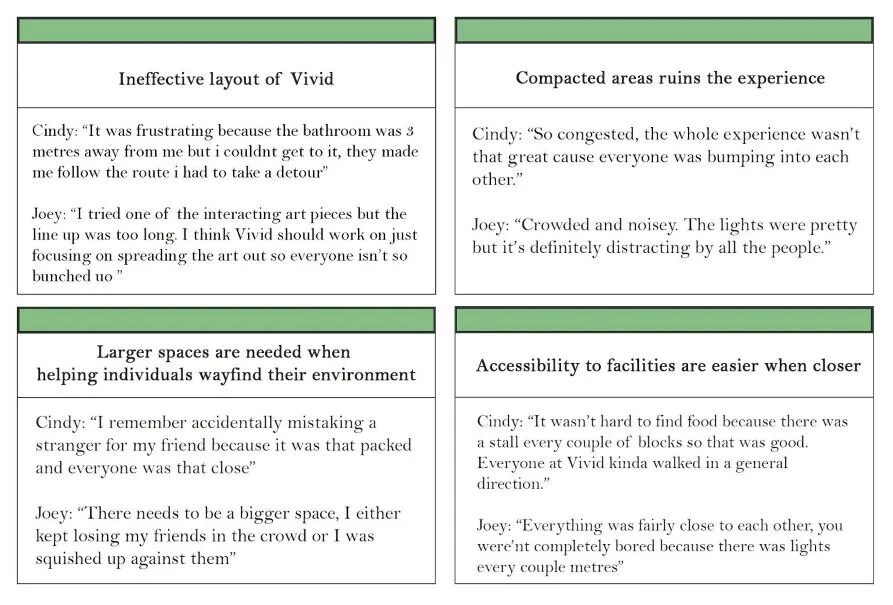
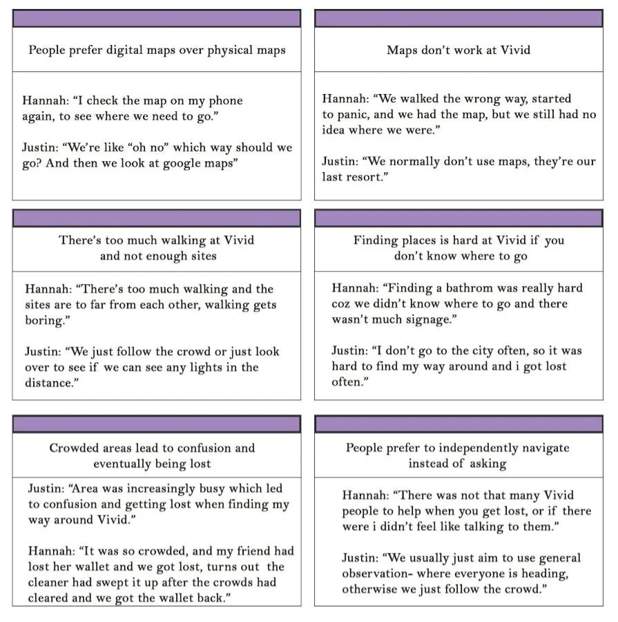
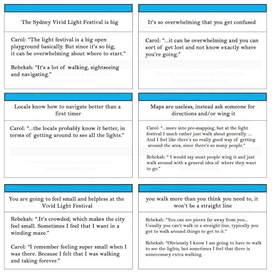
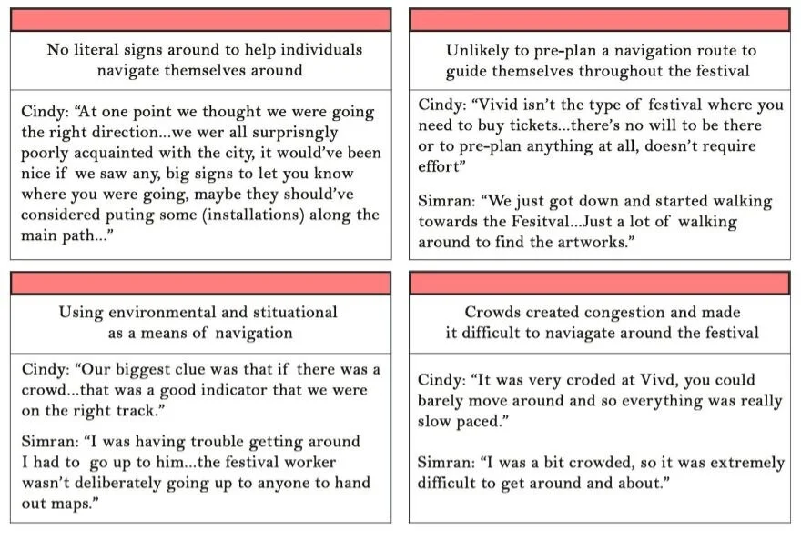
And so, from the interviews that we conducted from the sensitising and context-mapping exercises, we transcribed them and used statement cards to draw out the key insights and themes.

The statement cards were then grouped into piles of the same idea/theme and
we came up with 6 distinct groupings which can be seen in our visualisation poster.
They are: Lack of sites led to excess walking- Lack of signage made it hard to navigate- Crowded areas created congestion- Spontaneous planning is often preferred- Unfamiliar experiences lead to difficult mapping experiences- Maps are not beneficial to the navigational experience.
Research Visualisation
Our research visualisation highlights all our key points in an easy and fun way to read, thus making it more interesting and clear about what our insights are.

From these insights we realised that all users have different goals they want to accomplish by the end of their visit and so they also had different approaches to navigating through a crowded public festival. “we usually just aim to use general observation...otherwise we just follow the crowd” and “I'm more into pre-mapping”. However we realised that people tended to improvise due to the fact that visitors were not able to anticipate congestion, crowds and the possibility of getting lost. “I would say most people wing it and just walk around with the general idea of where they want to go”.
With all these different user types and approaches to cater to, our design solution provides a service in which they have the option to use our assistance and if not, our service will not hinder and interfere with their wayfinding experience.
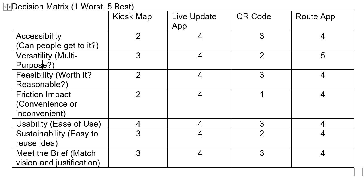
So, to try and reduce the subjectivity of decision making we decided to use a decision matrix when refining our chosen concept. Our decision matrix consists of 7 different factors and it has 4 different design concepts.
From the decision matrix we were able to see which ideas best fit our users and the services that we want to provide. When it came down to choosing between the app ideas we looked at the scoring and the Live Update App and Route app were basically even. So, we decided to just combine the two together as we thought both ideas would be best as we are trying to cater to as many users’ needs as possible.
Design Solution
There are two parts to our design solution, the first part is the home page- which will be a live update map of foot traffic in the Vivid area. This is intended to help users avoid the crowded areas. It will then have a “suggested route” section where it gives options of routes for the user to take. For example, there will be a least crowded route, most interactive route, if you’re going for the first time they’ll be a specific route for you and many more. If you decide to use the “specific route” option, then once you’ve completed the route it’ll also allow you to give feedback and rate your experience out of 5.
Thus, depending on their level of skills, and the way they want to approach the task they want to accomplish, they can either choose the suggested route if they want to plan further or if they want to independently navigate they can still use the live update map of the foot traffic, to make their experience a lot smoother. Therefore, this provides the user with a low stress, more enjoyable and seamless experience as they are allowed to navigate through Vivid in a flow state where they’re completely involved in the moment.
User Journey Map
